
Designing websites for China is not a matter of translating copy and hoping the global template still works. The real challenge is deciding what the website should help users understand quickly, what proof it should surface early, and how each page should guide the next action.
In this article, we focus on the design decisions that shape a stronger China-facing website: homepage hierarchy, navigation clarity, trust-signal placement, mobile sequencing, call-to-action logic, and page patterns for different business models.
Executive Summary:
1. A strong China-facing website answers practical user questions faster, surfaces trust earlier, and makes the next step clearer than many global website templates do.
2. The core design challenge is not whether a site looks “Chinese,” but whether its page hierarchy, navigation, and call-to-action structure match local browsing behavior and mobile-first expectations.
3. Chinese users accept higher information density than many Western teams expect, but the winning standard is dense clarity, not visual clutter.
4. QR codes, WeChat paths, WeCom consultation routes, and WeChat Mini Program handoffs should be treated as conversion-interface decisions, not footer extras.
5. B2B, luxury, and product-led journeys should not share the same page sequence, proof order, or call-to-action logic.
Table of contents
- How to Design Websites for a Chinese Audience: Start with the Website’s Job
- What a China-facing Website Should Optimize for
- Homepage Design: Lead with Proof, Clarity, and Action Paths
- Navigation Design: Reduce Guesswork
- Trust Signals: Place Them Where Friction Happens
- CTA Design, QR Codes, and WeChat Handoff
- Mobile Sequencing and Page Flow
- Page Templates by Business Model
- Performance and Compliance as Design Constraints
- Common Mistakes When Approaching Chinese Website Design
- What Decision-makers Should Lock Before Design Starts
- Conclusion
How to Design Websites for a Chinese Audience: Start with the Website’s Job
Many brands already understand that China requires a localized digital approach. The broader localization argument is covered in Why a Chinese Website Alone Isn’t Enough.
The harder challenge is turning that understanding into a website structure that helps users evaluate the offer quickly, find proof easily, and move to the right next step.
That does not mean every China-facing journey should revolve around the website.
In many B2C contexts, the stronger experience may sit in WeChat or a Mini Program, with the website playing a lighter supporting role.
Gucci’s China website mainly supports branding and product discovery, while the purchase journey continues in the brand’s WeChat Mini Program. (Disclaimer: Featured for illustration only; no affiliation with ITC.)
But in B2B, service-led, and other high-consideration journeys, the website still matters because it helps users understand the offer, validate the business, and move into the right next channel.
TLX Technologies shows a more direct B2B pattern: clear product pathways, practical information, and an obvious contact route.
In China, a website rarely works as a standalone conversion machine. Its role is to support trust, clarify the offer, and connect users to the actions and channels that move the journey forward, whether that means contacting the team, scanning a QR code, exploring proof, or continuing on WeChat.
When the opening message is vague, proof appears too late, navigation slows evaluation, or the next step feels weak, even a localized site can underperform.
What a China-facing Website Should Optimize for
A China-facing website should optimize for five things:
- Faster evaluation: Users should understand the offer, relevance, and seriousness of the company quickly.
- Earlier trust formation: Proof and legitimacy should appear before users have to hunt for them.
- Clearer browsing paths: Users should navigate by recognition, not guesswork.
- Stronger mobile usability: Content hierarchy should work on a phone first, not merely shrink from desktop.
- More credible next steps: Call-to-actions (CTAs) should reflect how the business actually wants users to continue the journey.
Research suggests that Chinese digital experiences often use higher information density than Western ones, but density alone does not guarantee usability. According to Nielsen Norman Group‘s usability research, scanning ease, navigation clarity, and task flow remain just as important to Chinese users.
Nielsen Norman Group’s cross-cultural UX research further shows that a visually polished interface is not enough for Chinese users if the page feels thin on useful information or slows down evaluation.
The implication is straightforward: The design goal is not “more content.” It is faster access to the right content.
Homepage Design: Lead with Proof, Clarity, and Action Paths
The homepage of a China-facing website should rarely behave like a global mood board. It should reduce uncertainty quickly.
Too many international homepages open with oversized brand statements, sparse copy, and a visually polished but commercially vague hero area. In China, that structure often slows evaluation.
A stronger homepage hierarchy looks like this:
1. Start with an Explicit Offer or Value Proposition
The first screen should make the business category and relevance obvious. Users should not have to decode abstract brand language before they understand what the company does.
That means:
- A concrete headline instead of a poetic slogan
- One short explanatory line on the service, product, or market relevance
- A primary CTA that reflects the real next step
- Visible evidence that the company is active and reachable
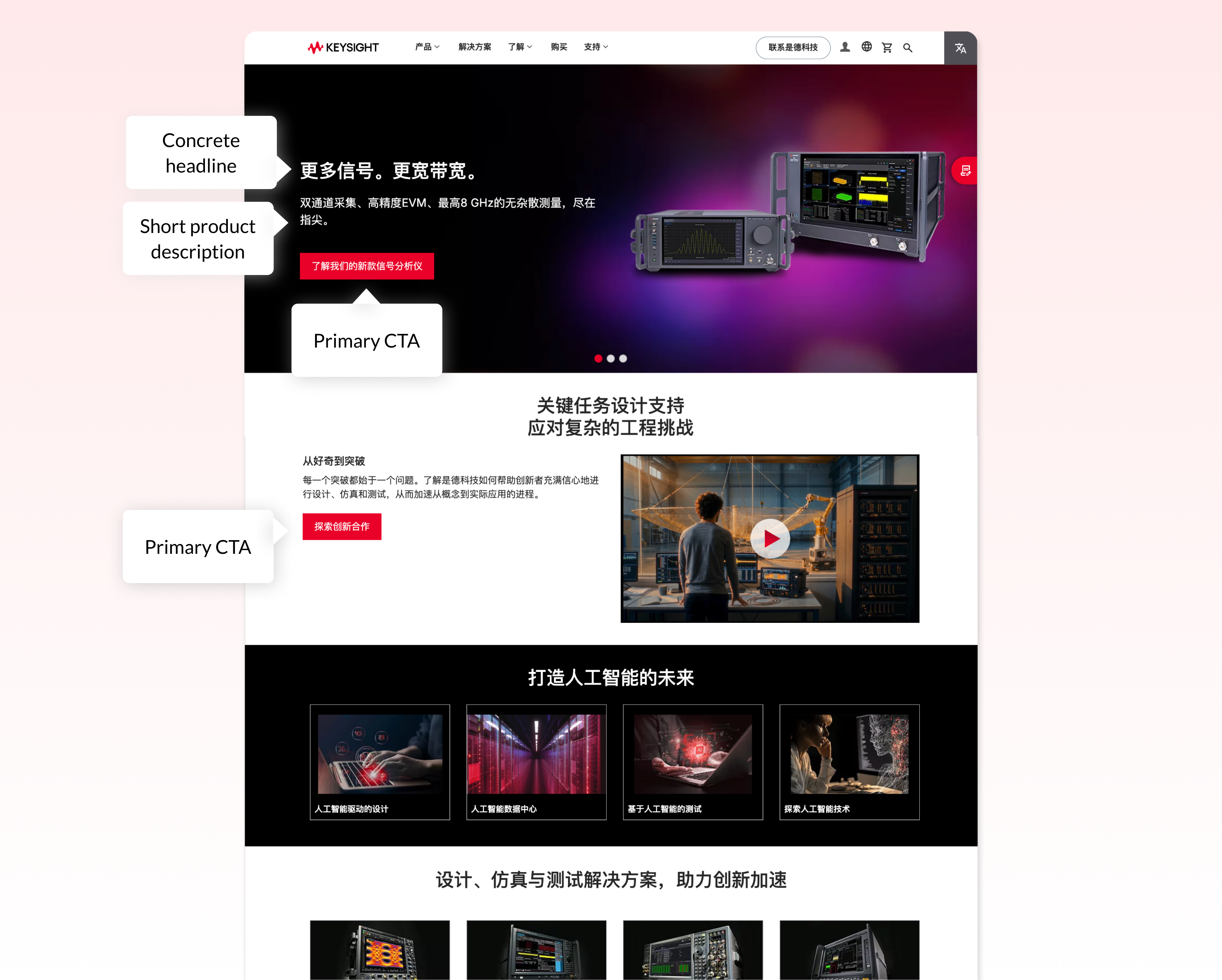
Keysight Technologies shows how a China-facing B2B homepage can state the offer early and route users quickly.
2. Move Proof Higher than Many Global Templates Do
Trust signals should not be buried several scrolls down.
Useful proof near the top of the homepage includes:
- Client or partner credibility where approval allows it
- Market-specific experience or capabilities
- Visible office, support, or contact presence
- Certifications, awards, or recognized platforms
- A short “why choose us” or “how we help” block
3. Give Users Clear Pathway Modules
After the hero, users should quickly see where to go next. Instead of forcing everyone through the same generic scroll, create route choices such as:
- Solutions by audience or industry
- Services by need
- Product categories
- Case studies or proof
- Consultation or contact path
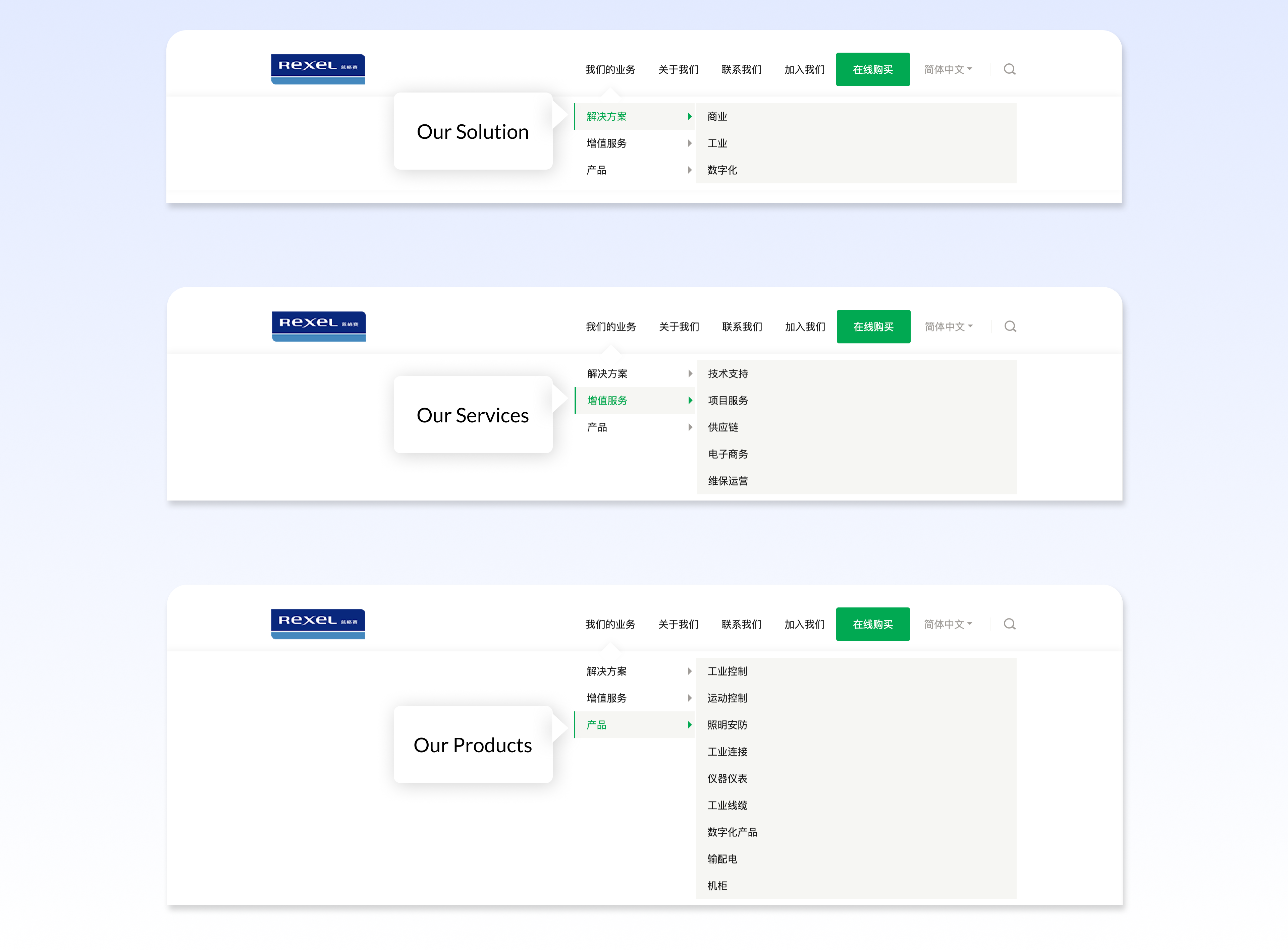
Rexel shows how clear menu routes can support faster B2B navigation.
A Practical First-screen Pattern for China-facing B2B Homepages
For many B2B Chinese websites, the first screen works best when it contains five elements in one tight block:
- A direct headline naming the offer
- A one-line explanation of who the offer is for
- One proof strip such as client logos, platform expertise, or market experience
- One primary CTA such as Book a consultation
- One secondary continuation path such as Scan to follow our WeChat Official Account
That combination answers the user’s first questions immediately: What do you do? Are you credible? What should I do next?
Navigation Design: Reduce Guesswork
Navigation is one of the clearest places where global website habits underperform in China.
Many international sites use elegant but vague labels, compressed menus, or architecture that makes sense only to internal brand teams. A China-facing website should lean toward clearer labels and more explicit routes.
Good practice includes:
- Plain-language navigation labels instead of internal brand wording
- Category names users recognize immediately
- Fewer ambiguous umbrella labels
- Access to key information within one or two taps from mobile
- Anchor links or jump links on longer pages
- Sticky navigation or persistent action points on content-heavy pages
Labels that Usually Outperform Vague Brand Language
In many China-facing B2B contexts, labels such as these outperform softer brand-first wording:
- Solutions instead of What We Imagine
- Industries instead of Who We Understand
- Case Studies instead of Stories
- Contact Our China Team instead of Start a Conversation
- WeChat Consultation instead of a generic social icon
The pattern is simple: The stronger option names the destination or action directly.
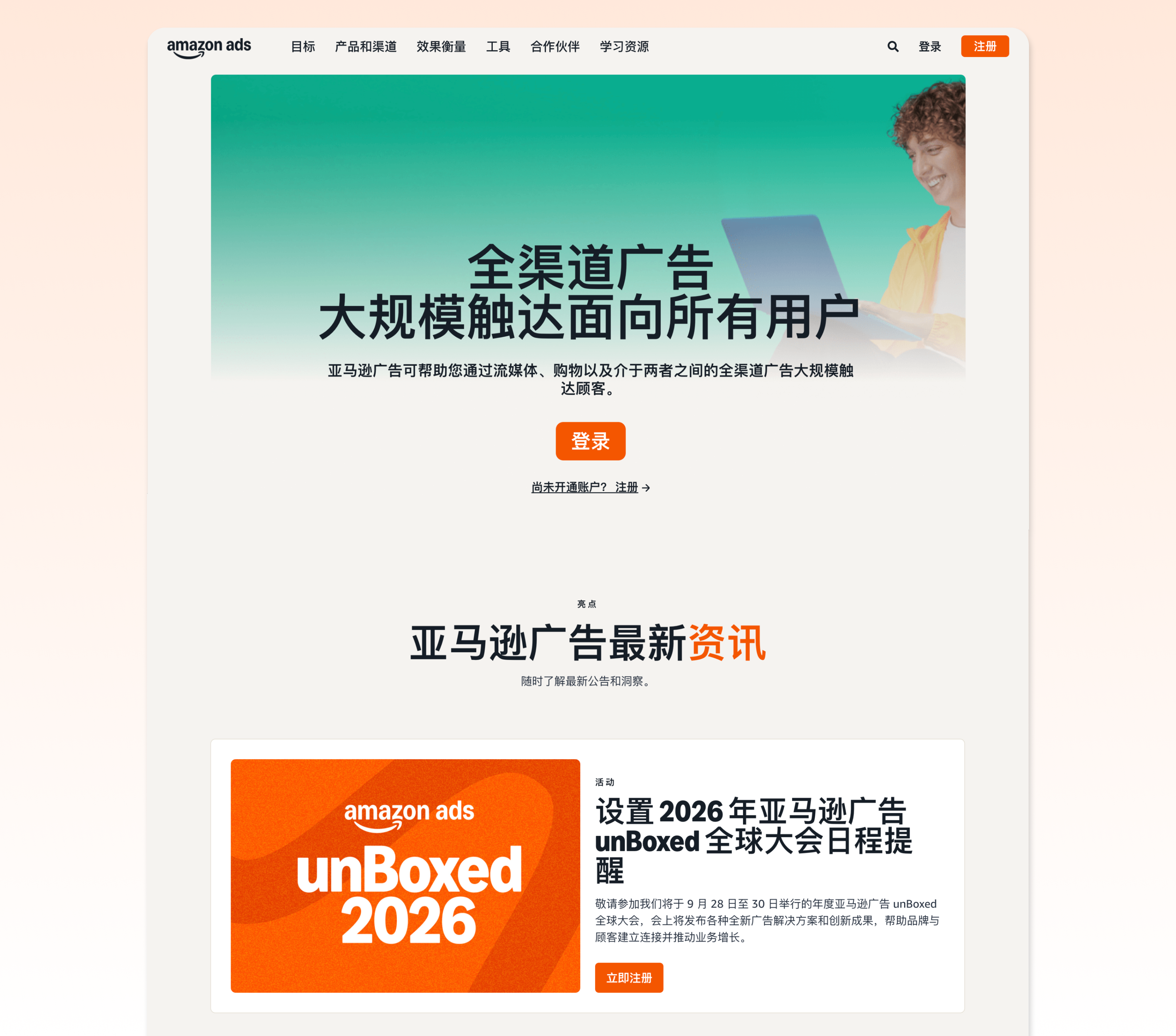
Amazon Advertising Platform shows how clear navigation labels reduce guesswork for Chinese users. (Disclaimer: Featured for illustration only; no affiliation with ITC.)
Trust Signals: Place Them Where Friction Happens
Trust on a China-facing website should not be isolated in one proof section. It should appear wherever hesitation is likely to happen. That means:
Near the Offer
When the site makes a strong claim, add supporting evidence nearby. If the page says the company supports China market entry, show proof of relevant capability, geography, or platform experience close to that message.
Near Action Points
If the user is being asked to contact, consult, register, or scan a QR code, place reassurance beside the CTA. That might include expected response time, service scope, who will answer, or what happens next.
Near Sensitive Information Requests
If a form asks for personal or business information, reduce uncertainty with concise privacy language, purpose explanation, and the minimum number of fields necessary.
In the Footer, But Not Only in the Footer
Company registration information, legal pages, and business contact details remain important. But if all credibility cues live only at the bottom of the page, many users never see them at the moment of decision.
CTA Design, QR Codes, and WeChat Handoff
One of the biggest design mistakes on China-facing websites is treating QR codes and WeChat handoffs like decorative social features.
They are part of conversion design.
The question is not whether a QR code exists. The question is when it deserves primary visual weight and what it helps the user do next.
When a QR Code Should Sit Beside the Main CTA
A QR code deserves early visual weight when the intended next step continues naturally on mobile, for example:
- Following a WeChat Official Account
- Contacting a consultant’s WeCom through WeChat
- Accessing a WeChat Mini Program
In those cases, placing the QR code beside the main CTA works well because it presents two credible continuation paths at once: desktop action and mobile handoff.
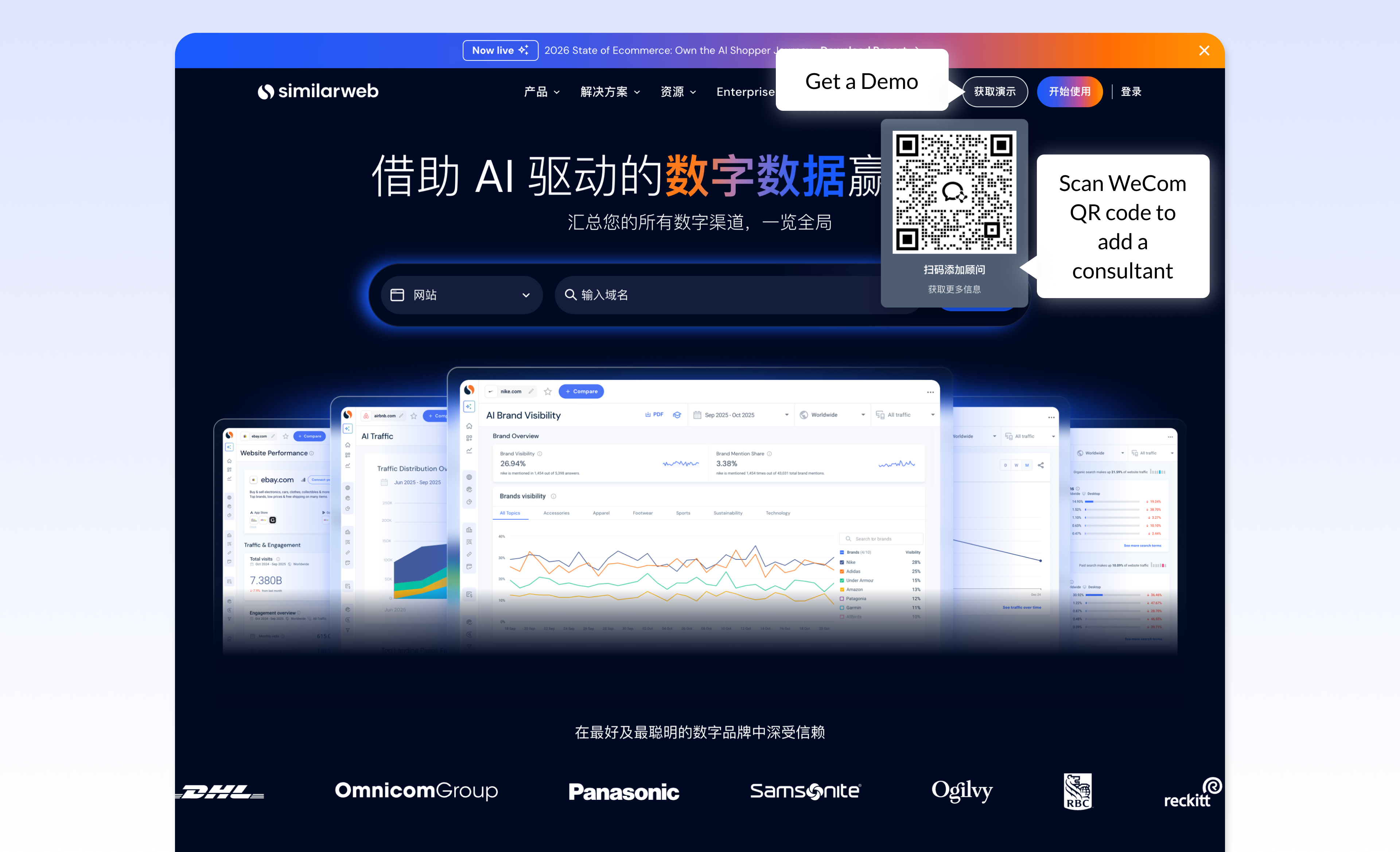
Similarweb gives its demo CTA a direct WeCom continuation path through a QR code. (Disclaimer: Featured for illustration only; no affiliation with ITC.)
When the QR Code Should Sit Below Proof Instead
If the journey is high-consideration B2B and the user still needs reassurance before taking action, the QR code often works better below the first layer of proof. That sequence lets the user absorb credibility first, then choose the continuation path.
When a Form Should Outrank a QR Code
A form can be the stronger primary CTA when the business needs a more controlled and qualified next step.
This often applies in enterprise B2B, but also in luxury and other high-consideration journeys where the brand wants a more selective first interaction that is easier to route.
A form is often the better primary route when:
- The request needs qualification before handoff
- The business needs specific customer or project details to route the inquiry correctly
- The brand wants to keep the first interaction inside a more controlled environment
- The journey is advisor-led, personalized, or high-consideration
- The business does not want to move the interaction immediately into WeChat
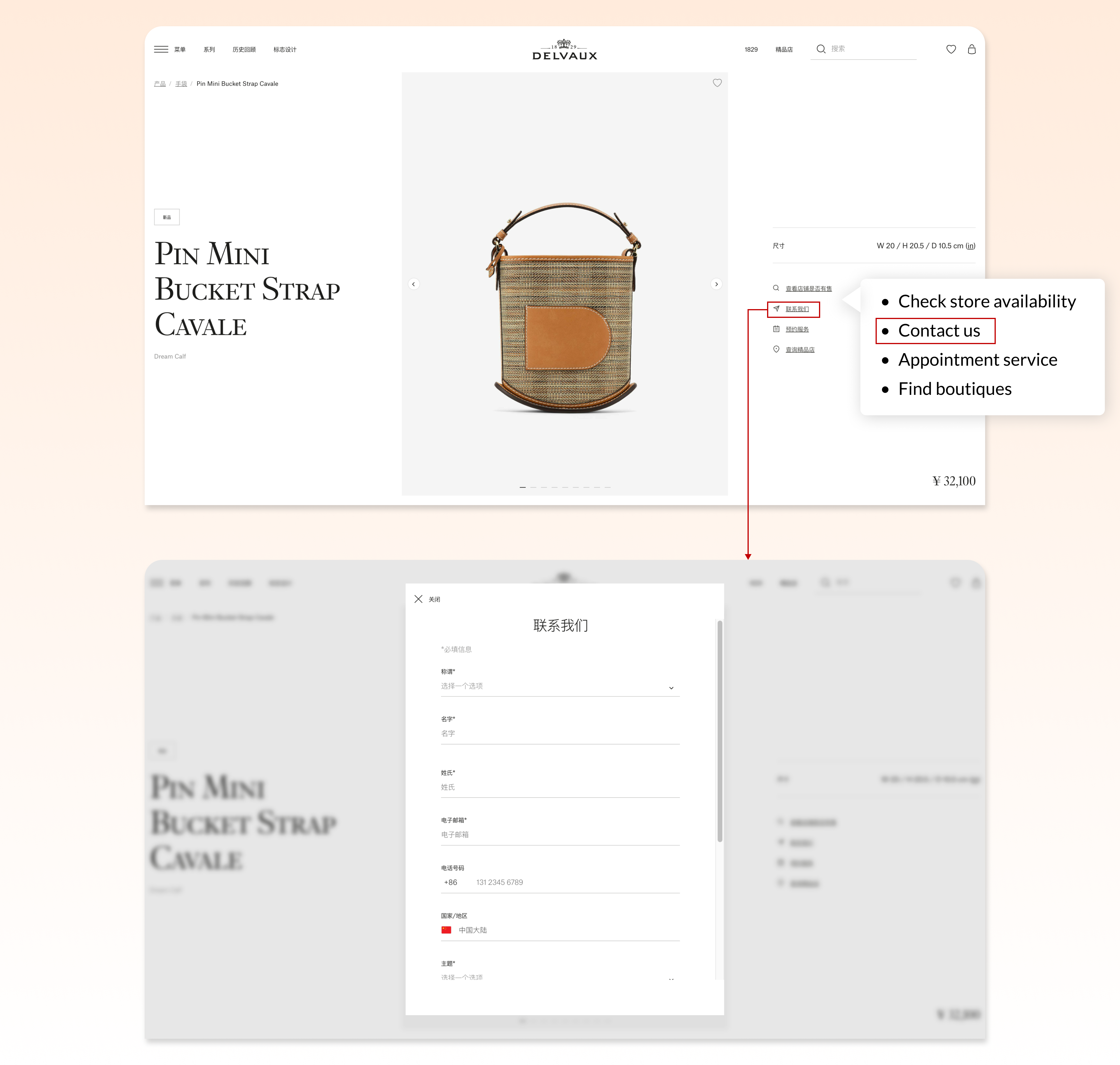
Delvaux shows how a luxury China site can use a structured form as a controlled next step. (Disclaimer: Featured for illustration only; no affiliation with ITC.)
If you plan to embed a global form such as HubSpot on your China website, read HubSpot Forms in China first. It explains why direct embedding often creates performance and conversion problems.
Use CTA Language That Sounds Like a Real Next Step
Generic buttons such as Submit or Learn More are weak. Stronger alternatives include:
- Speak with a China digital expert
- Book a consultation
- Contact our China team
- Scan to continue on WeChat
- Explore our China solutions
The CTA should describe a believable next action, not a website convention.
Mobile Sequencing and Page Flow
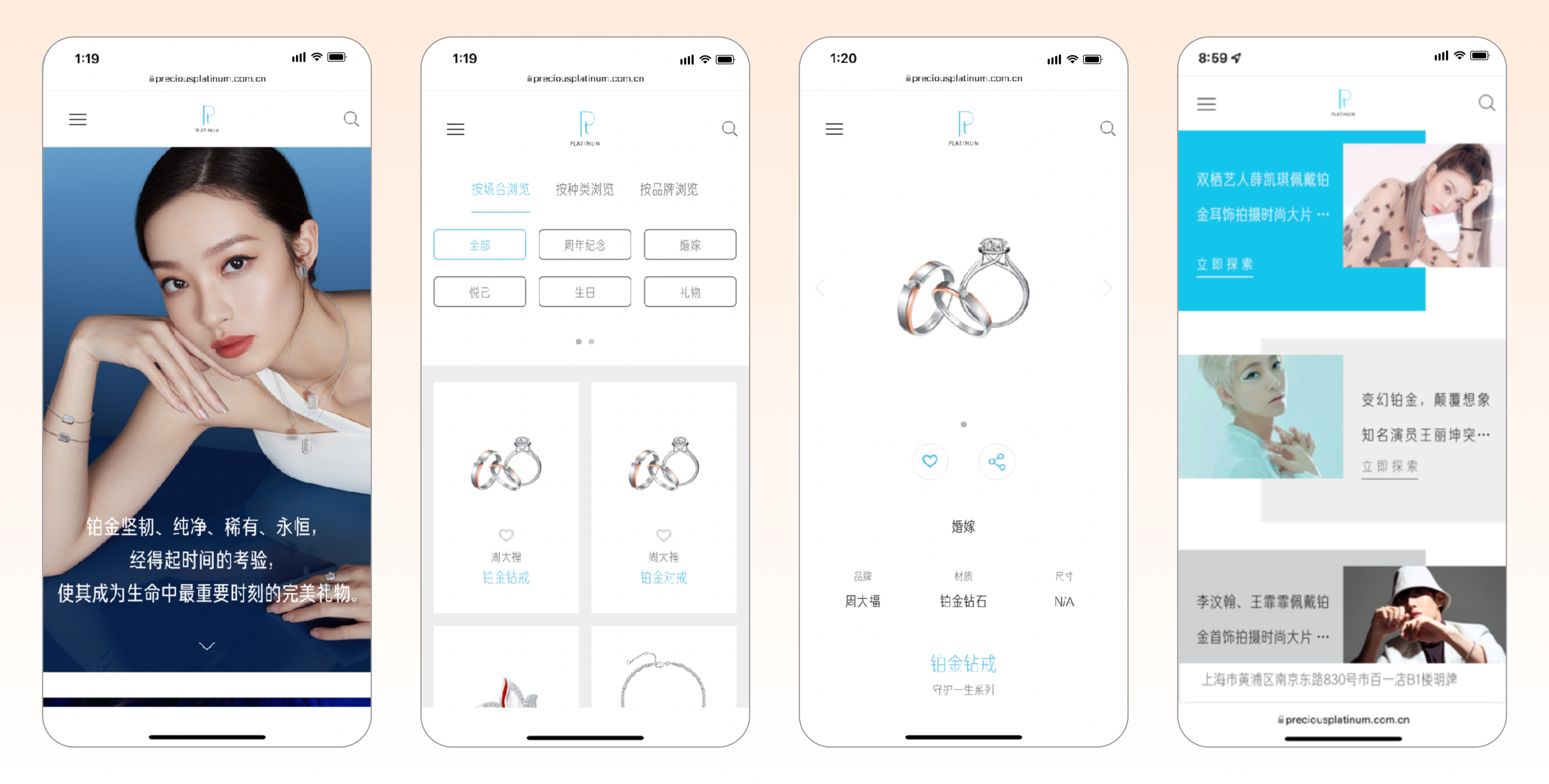
China website design should be mobile-first in more than a technical sense.
According to CNNIC’s 2025 data summary, 99.6% of China’s internet users accessed the internet via mobile (gov.cn summary of CNNIC data). That affects not just layout, but sequencing.
On mobile, the first two screens carry disproportionate weight. A practical content order is:
- Clear value proposition
- Primary proof
- Primary CTA or path choice
- Short service, product, or solution overview
- Deeper proof, explanation, and detail
- Secondary CTA
- Footer-level legal and operational information
Practical mobile rules include:
- Do not make users swipe through decorative hero space before reaching substance
- Keep headings concrete and scannable
- Use expandable sections when depth is needed
- Avoid long, fragile forms on mobile
- Make QR-code usage visually and functionally obvious
- Ensure buttons, contact paths, and page anchors are easy to tap
Page Templates by Business Model
A China-facing website should not be designed as if every business has the same user journey. The structure that works for a B2B solutions provider will not work the same way for a luxury brand, a distributor-led business, or an e-commerce offer.
B2B Service Page
A China-facing B2B service page should prioritize:
- A clear statement of problem and service relevance
- Sector or use-case specificity
- Proof of expertise and delivery credibility
- Visible consultation route
- Concise process framing
- FAQ content that resolves buying friction
A useful page sequence is: problem → solution fit → proof → service scope → CTA → FAQ.
Brand or Luxury Page
A brand-led page can preserve stronger visual control, but it still needs practical continuity.
It should include:
- Editorially polished but concrete storytelling
- Easy access to collection, category, or product pathways
- Visible store, advisor, or appointment routes where relevant
- QR-based continuation into WeChat or Mini Programs where that supports the journey
- Trust cues that feel premium rather than bureaucratic
A stronger sequence is: brand story → product or collection path → reassurance → appointment or advisor CTA.
Product Page or E-Commerce Support Page
For product-led journeys, users need faster access to decision information.
That means:
- Clear pricing logic where appropriate
- Product details surfaced without excessive tab-hiding
- Shipping, support, or availability clarity
- Visible trust and payment cues
- Explicit handoff to a local commerce environment if the main transaction happens elsewhere
A stronger sequence is: product value → decision details → trust and fulfillment cues → buy or continue path.
Performance and Compliance as Design Constraints
Performance and compliance matter because they shape the live user experience.
A visually polished website that loads slowly, relies on unstable third-party dependencies, or forces awkward mobile interactions is poorly designed in practice.
The same applies to compliance-related decisions. If hosting, infrastructure, consent handling, or ICP planning are left too late, teams often ship pages with compromised UX, delayed launches, or unnecessary friction.
So the useful design question is not simply, “Do we need to think about compliance?” It is:
- Will this page architecture remain usable once real scripts and integrations are added?
- Are we designing forms and data capture with governance in mind?
- Are we relying on tools that may degrade the experience inside China?
- Are we keeping page weight under control for mobile users?
That is where technical planning becomes a design issue.
Common Mistakes When Approaching Chinese Website Design
1. Using a brand-first homepage that says too little too late: If users need several scrolls to understand what the business offers, the hierarchy is wrong.
2. Confusing higher information density with permission for clutter: Chinese users may accept denser pages, but they still need order, grouping, and prioritization.
3. Hiding trust signals in isolated proof sections: Credibility should appear next to claims and CTAs, not only deep in the page.
4. Using vague navigation labels: Elegant wording that requires interpretation is a conversion tax.
5. Treating QR codes as secondary decoration: If WeChat continuation matters commercially, the interface should show that clearly.
6. Applying one template across B2B, brand, and commerce journeys: Different business models need different page logic.
What Decision-makers Should Lock Before Design Starts
Before briefing design or development teams, leaders should make four decisions explicitly:
- What is the real job of the website? Credibility, lead capture, product education, brand validation, channel handoff, or a mix?
- What is the primary continuation path? Consultation, WeChat, Mini Program, appointment, form inquiry, or direct transaction?
- What proof needs to appear early? Market credibility, client trust, platform capability, product depth, or local operational readiness?
- Which page types matter most? Homepage, service pages, product pages, brand pages, contact pages, or all of the above?
When those decisions are vague, design quality turns into a debate about aesthetics.
When those decisions are clear, design becomes easier to prioritize, measure, and improve.
Conclusion
Designing websites for a Chinese audience is a page-architecture challenge before it is a style exercise.
The strongest sites win because they make the offer clearer, the navigation easier, the trust signals more visible, and the next step more believable for the user in front of the screen.
That is what makes a China-facing website effective: not abstract localization language, but a structure that helps users evaluate, trust, and act.


