
A company should not redesign its website on a fixed schedule alone. In practice, the right timing depends on when the website stops aligning with user expectations, business priorities, and technical needs.
In this article, we explain why the old “redesign every few years” rule is no longer enough, what signals actually matter, and how enterprise teams can decide whether they need continuous optimization, a user experience (UX) refresh, a replatforming effort, or a broader digital transformation.
For senior digital decision-makers, that shift in thinking matters. A website is no longer just a marketing asset. It is often a conversion platform, a content engine, an integration layer, and part of a wider customer experience ecosystem.
Executive Summary:
1. There is no universal website redesign timeline; the better question is whether the site still supports current users, business goals, and technical requirements.
2. Most websites begin to lose effectiveness well before they become obviously “old” because UX expectations, content structures, and business priorities evolve continuously.
3. The clearest redesign signals usually appear across three areas: experience, business alignment, and technology constraints.
4. Many companies do not need a full redesign first; they may need structured optimization, a UX refresh, or replatforming, depending on severity, scope, and system flexibility.
5. For China-facing brands, the decision is even more strategic because the website may function less as the sole destination and more as one node within a platform-driven ecosystem.
Table of Contents
- Why the Old Website Redesign Timeline No Longer Works
- Why Websites Become Outdated Faster Than Before
- The Signs Your Website Needs Improvement or Redesign
- How to Choose the Right Level of Change
- Why Chinese Website Redesign Needs a Different Lens
- A Practical Website Redesign Planning Rhythm for Enterprise Teams
- Conclusion
Why the Old Website Redesign Timeline No Longer Works
A common assumption is that a company should redesign its website every three, five, or even ten years. That sounds tidy, but it is no longer a reliable rule.
Modern websites do not age mainly because time passes. They age because alignment breaks.
At launch, the experience is usually aligned with current user expectations, current business priorities, and current technology decisions. After that, each of those layers evolves at a different pace:
- User expectations shift as people spend time on faster, clearer, and more intuitive digital experiences elsewhere.
- Business teams launch new services, enter new markets, and update messaging.
- Technology stacks accumulate constraints, especially when content operations become more complex or integrations expand.
More details will be discussed below.
That is why a website can look acceptable on the surface while quietly becoming less useful underneath.
The bigger risk is not that a site looks dated. The bigger risk is that it stops supporting growth, conversion, and operational efficiency.
Why Websites Become Outdated Faster Than Before
Most enterprise websites begin drifting away from business and user needs sooner than teams expect. That drift usually happens across several layers at once.
Experience Patterns Change Quickly
As Jakob’s Law suggests, users prefer interfaces that feel familiar because they spend most of their time on other sites. When navigation, content hierarchy, or interaction patterns feel harder than what users now consider normal, friction grows.

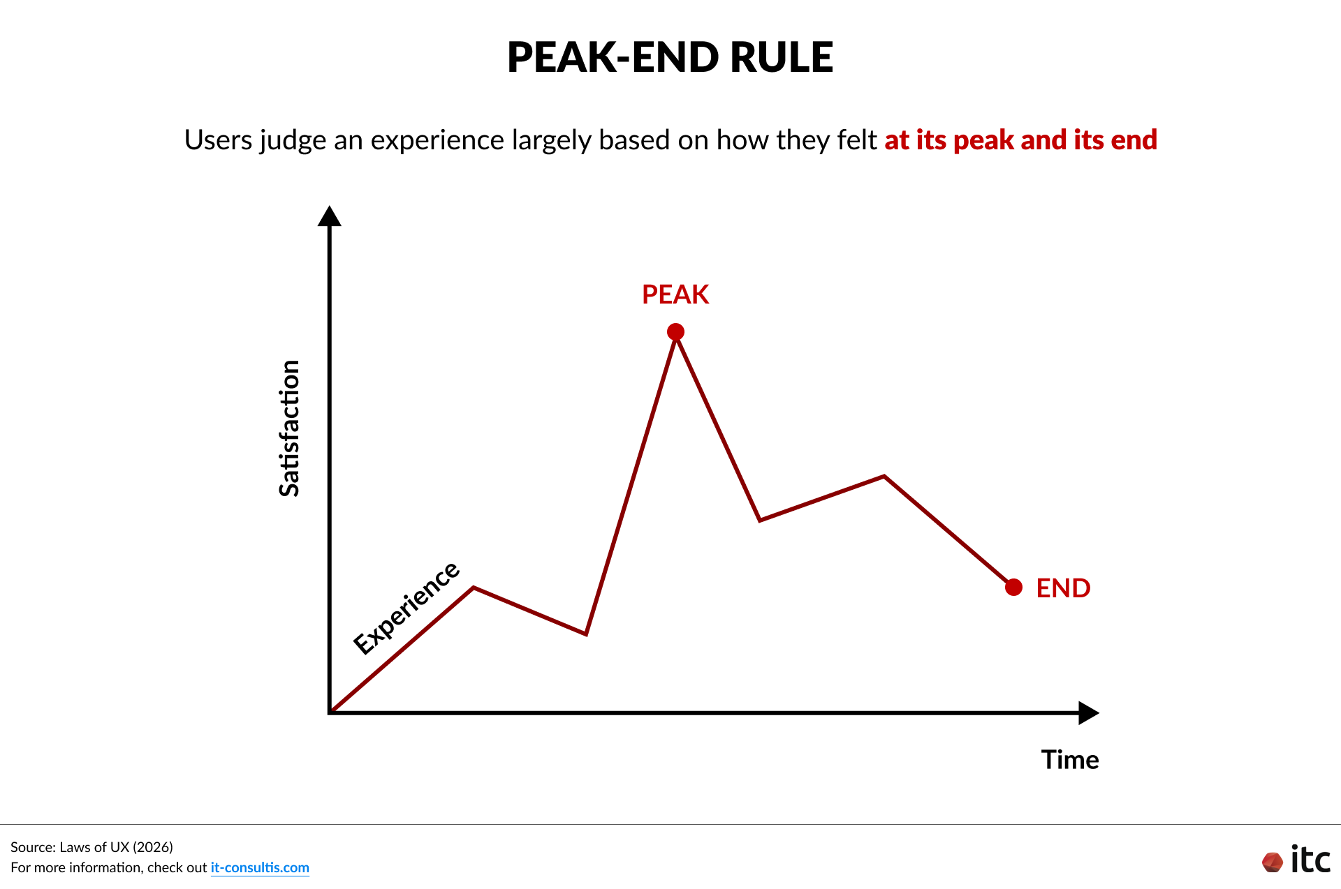
Users Remember Key Moments Rather than Average Quality
The Peak-End Rule helps explain why one frustrating journey or weak final interaction can shape the overall perception of a site.
A website does not need to fail everywhere to feel outdated. It only needs to fail at a few critical moments.
Content and Strategy Drift Apart
Many companies add pages, campaigns, product lines, or services over time without rethinking the overall structure. The result is often bloated navigation, unclear messaging, duplicated content, and journeys that reflect internal silos rather than user needs.
Technology Can Become the Hidden Bottleneck
A rigid content management system (CMS), inconsistent component structure, weak design system, or growing integration complexity can make even simple improvements harder to deliver.
At that point, the problem is no longer only UX. The platform itself begins constraining progress.
Performance Standards Keep Rising
Core Web Vitals remain a useful diagnostic lens.
According to web.dev’s guidance on Core Web Vitals, strong performance generally means:
- Largest Contentful Paint (LCP: how quickly the main content of a page becomes visible to the user) at or below 2.5 seconds
- Interaction to Next Paint (INP: how quickly the website responds when a user clicks, taps, or types) at or below 200 milliseconds
- Cumulative Layout Shift (CLS: how visually stable the page is while loading, without unexpected movement of text, buttons, or images) at or below 0.1
When a site repeatedly misses those thresholds, the issue may point to deeper structural or architectural problems rather than isolated tuning opportunities.
The Signs Your Website Needs Improvement or Redesign
A good redesign decision should not start with “Does the website look old?” It should start with “Is the website still effectively supporting what users and the business need today?”
There are four main diagnostic areas decision-makers should keep in mind:

1. Experience Signals
These are usually the most visible symptoms:
- Users struggle to find important information.
- Navigation feels complex, inconsistent, or overloaded.
- Mobile usability is weak.
- Key journeys have high drop-off.
- Pages feel inconsistent because the interface lacks system-level coherence.
From a UX perspective, outdated experiences are often defined less by visual age and more by the amount of effort users must spend to understand, navigate, and act.
2. Business Signals
These show up when the site no longer reflects the business clearly:
- Offerings or service lines are outdated, unclear, or fragmented.
- Messaging no longer reflects current positioning.
- Content lacks hierarchy and becomes harder to scan.
- Conversions decline even though traffic or brand awareness may still exist.
- Different teams update content without enough governance.
This kind of drift is especially common when websites are treated as one-time projects instead of ongoing digital products.
3. Technology Signals
These often determine whether improvement is easy or difficult:
- The CMS is difficult to manage.
- Performance is slow or inconsistent.
- Integrations are limited or increasingly fragile.
- New features are hard to scale or extend.
- The system cannot support reusable components, scalable content structures, or efficient governance.
When these issues pile up, the website stops being merely imperfect and starts becoming a business constraint.
4. Ecosystem Signals
These appear when the website is no longer working well as part of the broader digital journey:
- The website feels disconnected from other key platforms, such as apps, WeChat touchpoints, or other marketing channels.
- Customer experiences feel inconsistent across channels.
- There is no unified customer journey across the ecosystem.
- Personalization is limited because data and touchpoints are not well-connected.
- User insights remain fragmented across platforms, making optimization harder.
In these cases, the issue is not only the website itself, but how well it connects to the wider ecosystem around it. A site may still work reasonably well in isolation while failing to support the connected journeys that users and businesses increasingly expect.
How to Choose the Right Level of Change
Not every problem requires the same type of response. A full redesign is only one option.
A more useful model is to assess signals based on severity, scope, and constraint. In other words:
- How serious is the problem?
- How widely does it affect the experience?
- Can the current system support the change that is needed?
This matters because many organizations either overreact too early with a full rebuild or wait too long while friction compounds. The goal is to match the response to the real level of misalignment.
From there, teams can choose among four levels of transformation:

Level 1: Continuous Website Optimization
This is the right path when problems are local, and the system is still flexible.
Typical cases include small UX issues, isolated content fixes, accessibility improvements, or performance tuning. The goal is to improve what already exists without disrupting the overall platform.
Level 2: Structured Website UX Design Refresh
This makes sense when the visual language, information architecture, or major journeys feel dated, but the foundation is still workable.
A UX refresh may involve navigation redesign, interface modernization, stronger page hierarchy, and the beginning of a more robust design system. The aim is to realign the experience without rebuilding the entire platform.
Level 3: Website Experience Replatforming
This becomes relevant when platform limitations start slowing down content operations, integrations, scalability, or performance.
At this stage, a company may need a backend (CMS and/or E-Commerce) upgrade, migration or replatforming, modular architecture work, or stronger integration foundations. The main objective is to upgrade the foundation so the experience can keep evolving.
Level 4: Platform Transformation
This is necessary when the website is blocking growth, when business changes are significant, or when the organization needs a more connected ecosystem.
That may include composable or headless architecture, broader omnichannel design, deeper data integration, and infrastructure changes that support long-term scale.
A practical rule of thumb is simple: Improve when the foundation still supports evolution. Redesign when the foundation itself becomes the constraint.
Why Chinese Website Redesign Needs a Different Lens
For global brands operating in or expanding into China, the Chinese website redesign question becomes more nuanced.
In many global markets, the website still acts as the central hub of the digital journey. Search, campaigns, social, and content channels often drive traffic back to the site, where engagement and conversion happen.
In China, that role is often more distributed.
Discovery, engagement, and conversion may happen across ecosystems such as WeChat, RedNote, Douyin, Tmall, and JD.com, which means the Chinese website is frequently one touchpoint within a broader ecosystem rather than the default center of the experience.
That does not make the website less important. It changes what the website needs to do and how brands should evaluate its success.

For many brands, especially those operating in platform-led China ecosystems, the website works best as a credible bridge: a fast, localized, easy-to-navigate destination that gives users essential information and smoothly directs them toward the platforms where ongoing engagement actually happens (e.g., WeChat).
However, for some, the .cn website can remain much more central.
This is often true for well-established global brands that need a strong owned presence to reinforce authority, support more complex journeys, and serve multiple stakeholder needs.
It is also particularly relevant for B2B companies, where desktop research, search visibility, credibility checks, and lead generation still rely heavily on the website.
This means a China-facing website may need to prioritize:
- Clear brand credibility and localized essential content
- Strong search visibility and discoverability for China-based users
- Integration with CRM, social, and broader ecosystem touchpoints
- Fast performance and usability for local audiences
- A role that fits the wider China journey, whether as a bridge, a core pillar, or both
For a broader perspective on how Chinese websites fit into a brand’s China digital strategy, see why a Chinese website alone is not enough and what Chinese website localization really requires.
For decision-makers, the key implication is this: redesign timing should reflect not just whether the Chinese website looks outdated, but whether its current role in the China ecosystem still matches the brand’s market position, audience behavior, and business goals.
In some cases, the right move is not a dramatic visual overhaul, but a structural, content, or architectural adjustment that better supports how the website actually functions in China.
A Practical Website Redesign Planning Rhythm for Enterprise Teams
If there is no fixed redesign timeline, what should companies do instead?
A more mature approach is to replace the one-off redesign mindset with a structured review rhythm.
Use a Continuous Review Model
Rather than waiting for a major crisis, evaluate the website regularly across experience, business alignment, and technology. That usually means monitoring performance and friction continuously, then conducting a more structured review at planned intervals.
For many enterprise teams, a practical rhythm looks like this:
- Ongoing: Track UX friction, conversion issues, content gaps, and performance signals.
- Every 6–12 months: Run a structured website review or UX audit.
- Every 2–3 years: Reassess whether a broader UX refresh is needed.
- As business or platform shifts occur: Re-evaluate immediately rather than waiting for the calendar.
This is not a rigid formula. It is a governance rhythm that helps teams avoid both overreacting and waiting too long.
Use UX Design Audits as an Early-Warning System
A website UX audit is valuable because it surfaces friction before it becomes a larger structural issue. It can help identify problems in navigation, content hierarchy, journey flow, consistency, mobile usability, and interaction patterns.
More importantly, it often reveals whether those symptoms are rooted in deeper issues such as governance gaps, outdated content structures, or platform constraints.
That makes the audit useful not just for design refinement, but for strategic decision-making.
Treat the Website as a Product, Not a Project
This may be the most important organizational shift.
When a website is treated as a finished deliverable, complexity accumulates by default. Ownership becomes fragmented, teams work around limitations, and the cost of change rises slowly until a much larger intervention is required.
When it is treated as a product, the organization is more likely to maintain governance, measure performance meaningfully, and evolve the platform before friction becomes systemic.
Conclusion
So, how often should a company redesign its website?
The most accurate answer is: not by age alone, but whenever the website is no longer aligned with user expectations, business direction, and technical reality.
For some organizations, that means continuous optimization is enough. For others, a UX refresh may be overdue after a few years.
And for more complex enterprises, the real need may be replatforming or broader transformation because the current foundation is limiting what the business can do next.
The key is to stop asking whether the site merely looks old and start asking whether it still supports growth, clarity, speed, and connected customer journeys.
That is the shift from redesign as a periodic event to website evolution as an ongoing strategy.
At IT Consultis (ITC), we combine an award-winning Design Studio with in-house website development capabilities for global and Chinese markets, helping brands turn creative vision into technically sound, market-ready digital experiences.


