Blog/E-Commerce/[11 Tips] How to Improve eCommerce Website to Boost Conversion

In this article, you can learn 11 expert tips on how to improve your eCommerce website that can definitely do a lot better with the right guidance.
Keep in mind that great eCommerce websites generally do not happen overnight.
Many new business owners miss a lot of minor details that make a big difference in the user experience. And that's what sets a website that converts and one that hardly ever does apart.
Thus, don't worry if yours is not 100% perfect from the get-go. Below are 11 eCommerce website tips you can always implement to deliver a better user experience and increase online sales.
1. Use Large Product Images
All the best e-Commerce sites use large images that show the product in the best light possible!
Online shopping takes away the joy of physically inspecting and handling merchandise. Therefore, your website should recreate that experience by using high-resolution images to satisfy your customers’ curiosity and entice their wallets.
In addition, make sure to enable users to zoom in and out of the images as well. And, preferably, you should show as many angles of the products as possible to enable the best visualization.
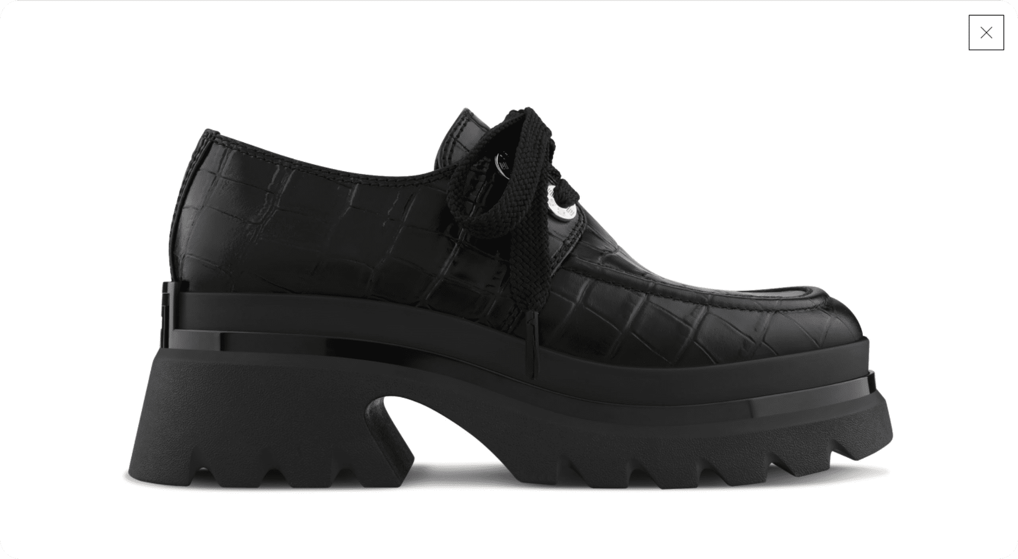
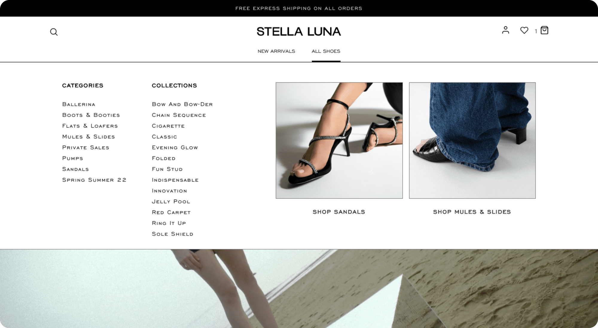
Stella Luna - one of our past clients - shows a great use of images on its product page!
On the outer left, there is a gallery of thumbnail-sized product images from different angles. The user can click on any of these thumbnails to view Stella Luna shoes in a larger size. These larger images appear between the gallery and the product name and description (on the right).
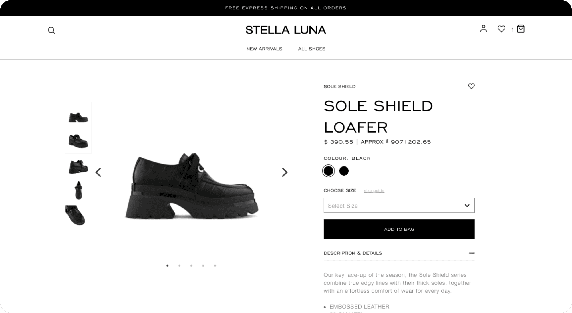
Moreover, if the user wishes to take a closer look, they can click on any medium-sized image and the whole gallery would appear on full screen. All the user has to do then is scroll up and down to see even the tiniest details on Stella Luna shoes and make an informed purchasing decision.
e-Commerce Product Images Best Practices
- Get professional-quality product photos.
- Showcase each product from various angles - front, sides, and back.
- Make images zoomable so that customers can appreciate all product details.
- Make sure the proportion of the images makes sense. Having a pick-and-mix of image sizes does nothing to showcase your product. It also makes your website design look inconsistent and... tacky.
- Consider the image’s background. A white background can be minimalist and clean. But natural, everyday backgrounds (e.g. a wooden bench, creased fabric, stone tiles) can be appealing as well. Just make sure it's relevant!
- When it comes to product images, sometimes no background is your best option. You can easily remove it from your product image using convenient tools online or Photoshop (e.g. Lasso, Pen, Magic Wand).
- Remember to optimize your images so that they do not affect your website loading speed. You should resize it to the SMALLEST OPTIMAL resolutions and compress it WITHOUT compromising its quality before finally uploading it to your website.
2. Include Detailed Product Descriptions
Customers do not just want a nice-looking product. They want to make sure that the purchase would satisfy their needs, which is where product descriptions come into play.
Having detailed, enticing descriptions also show an e-Commerce site’s passion for its products, making customers more likely to buy.
In addition, no one is going to buy your products if they do not know of them! Descriptions that are relevant to your target customers' search intent and what they are actually typing into search engines have a better chance of ranking on Search Engine Results Pages (SERPs).
Did you know that 75% of users never scroll past the first search results page? Thus, if you do not optimize your site for search engines (most likely Google since it accounts for the largest search volume - 92.5%), you will hardly reach anyone.
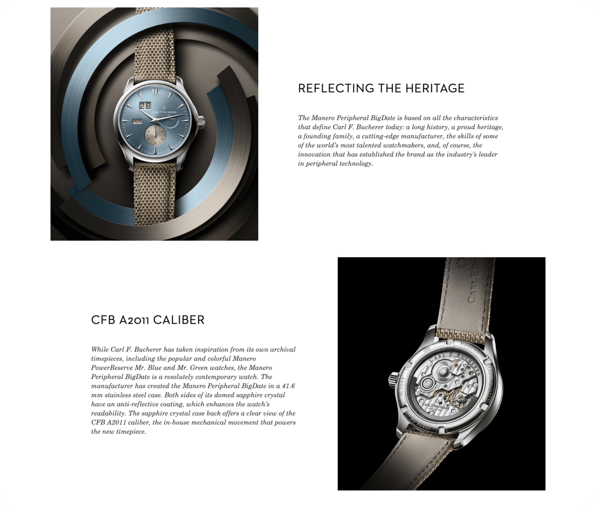
The online shop of our past client Carl F. Bucherer is a great example of product descriptions done right. Being a Swiss watchmaker specializing in luxury mechanical watches, the brand cares all about the little details.
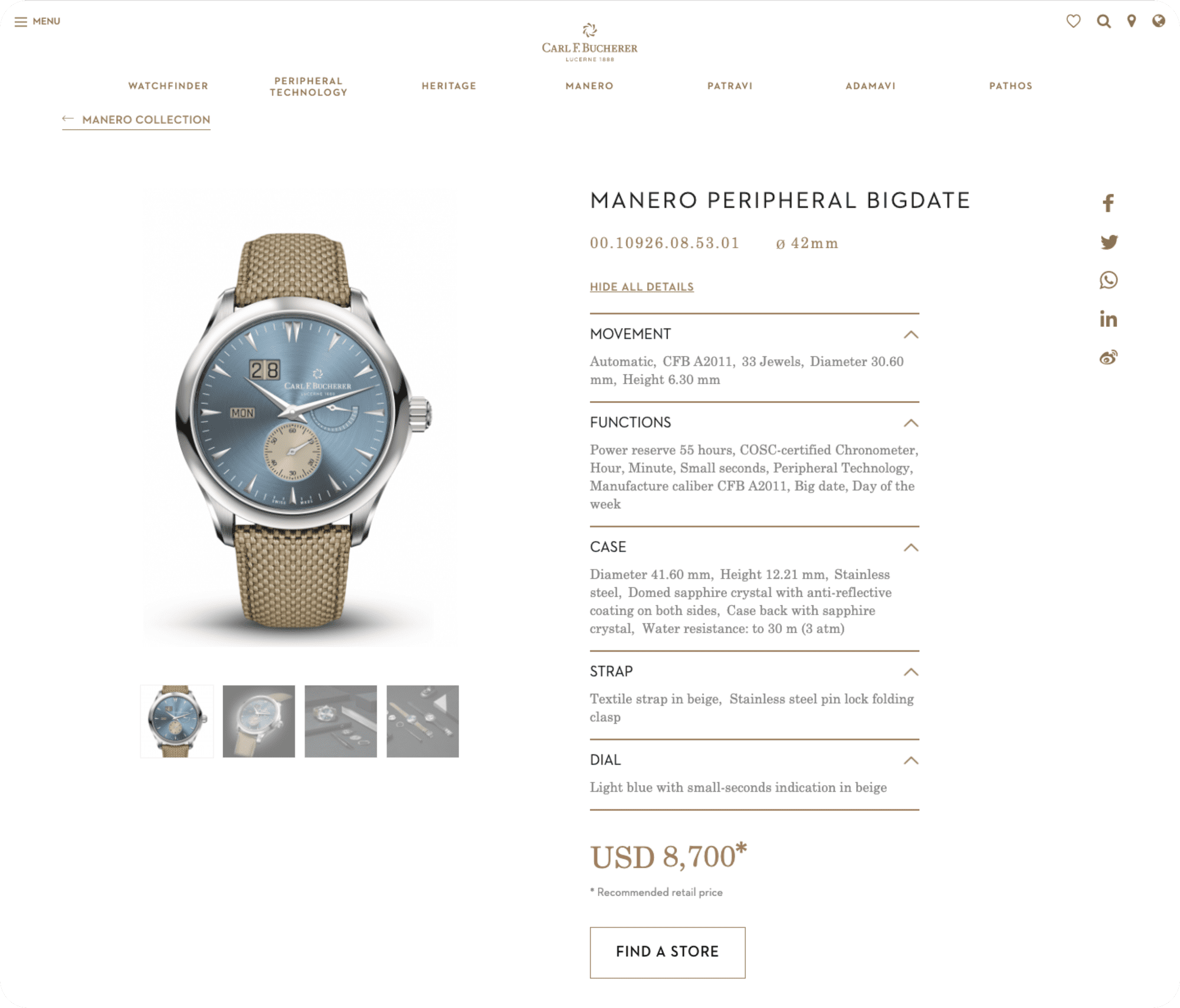
On its product page, Carl F. Bucherer lists out all of the features its consumer would care about and want to know more about, including its movement, functions, and the materials of the case, strap, and dial. The sub-headings and drop-down specifications make it easy for users to follow and catch.
In addition, for those intrigued to learn more, they can also scroll down past the videos and read the detailed descriptions of the functions, behind-the-scene, and history.
How to Write Product Description for an eCommerce Website
- Include all important details about a product - weight, dimensions, material, available colors, sizes, age restrictions, etc.
- Highlight the product’s features and advantages, and who they are most suitable for.
- Be careful with adjectives. If there are too many, it will sound cheesy and overdone. But, if there are too few, your description will read like a user manual. Try to balance the technicalities with just the right amount of flare for your particular product.
- While search engine optimization (SEO) is necessary, avoid over-stuffing your product page (or any other page on your eCommerce website) with keywords. It may work in the short term and you may slide into the 1st SERP. However, users will not like what they see and neither will Google. Make sure you are writing for humans first and foremost, and search engines second.
3. Have Clear Categories and Navigation
Categories make it easier for customers to locate the product they want to buy or at least narrow down their options if they are still window shopping.
If you want your business to succeed, there is absolutely no reason why you would make it harder for your customers to make a purchase, so having well-organized and easy-to-navigate categories is crucial.
The Stella Luna website that ITC helped develop is also a great example of what categories should look like. Users can easily find the type of shoe they're looking for via the Navigation Bar, from Ballerinas and Sandals to Boots, Mules, and Pumps.
Carl F. Bucherer, on the other hand, has taken categorizing to the next level! It has a dedicated WatchFinder section on the Navigation Bar.
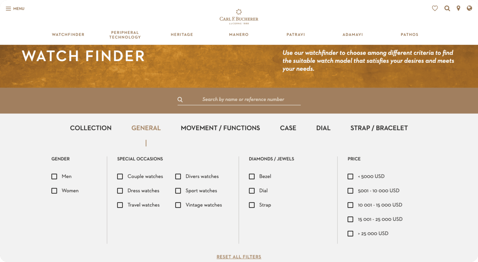
Once the user clicks on it, they can search for a suitable timepiece that caters to their preferences by adding as many detailed filters as they desire. They can filter by General factors (gender, occasions, jewels, price range), Collection, or more intricate aesthetic details of the Case, Dial, or Strap.
Recommendations for eCommerce Category Page Design
- Make sure your categories and subcategories are as organized as possible.
- A nice touch is to have categories that suggest items to customers and help them with their decision. For example, Carl F. Bucherer has filters for Couple watches, Travel watches, and even Divers watches.
4. Have a Useful Search Function
A search engine complements your website's categories, but it can become confusing when it turns up lots of results that have nothing to do with the customer’s query.
In some ways, having lots of different results can catch the attention of curious customers who just might click on those items, but what about your serious buyer who already knows what he or she wants?
These are the people the search function serves; the ones who know what they came to buy and don't feel like sorting through the whole website to find what they need. Take this for example:
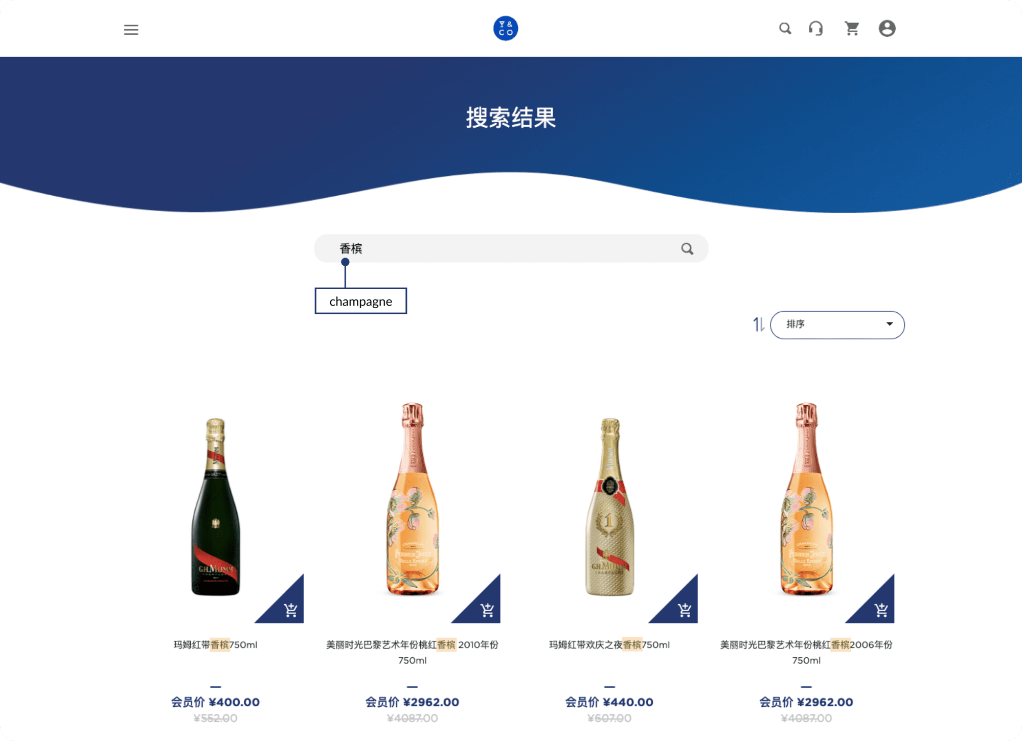
ITC also helped Pernod Ricard build its Drinks&Co website in China, which consumers can access to easily buy different alcoholic drinks the brand offers.
The search function on DrinksandCo.cn will show you all of the products that contain the keywords you typed in, making it very convenient for users who already know what they are looking for.
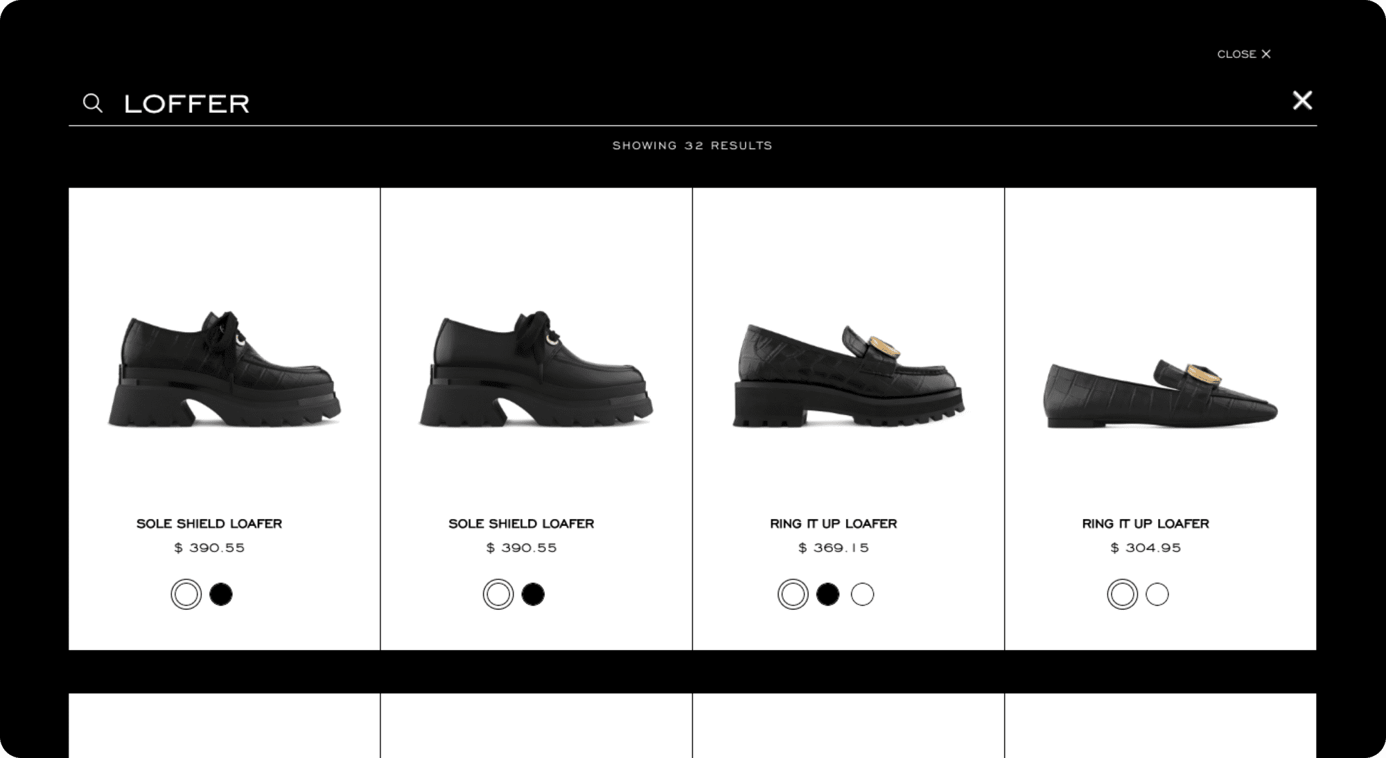
Stella Luna takes this a bit further. Knowing that humans make mistakes, including typos when typing into the search input field, the brand ensures that its search function still recognizes these to showcase the right results.
For example, when typing in "loffer", the brand still manages to show products that match the user's search intent - "Loafers".
In addition, you should know that most Content Management Systems (CMSs) have their own way of crawling content. For Magento, the classification of results can be random, chronological, or by relevance.
With Magento projects like Stella Luna and Pernod Ricard, we usually organized the search by assigning relevance points. A search term found in the title will typically be 10 times more important than the one in the description.
For instance, if you are looking for Loafers, all titles that feature "loafer" will have a weight of 10 and be featured at the top of the search results. And, if it is featured in the description, they get an additional point or two if written twice.
Finally, if the results are equally weighted, the most recent product will show up first in the search.
How do I Improve my Search Bar eCommerce?
- Know your CMS enough to be able to customize your own search function and prioritize the content you would like your user to see first.
- Include filters in your search results page to allow customers to refine their searches, and quickly find what they are looking for.
- Keep in mind that if your eCommerce website is still small and has a great navigation system, there is no need for developing a search function right away.
5. Simplify the Check-Out Process
Once customers are interested in your product and have clicked that Buy button, you are in a delicate position to maintain their interest. If too many steps stand between their way and the final purchase, there is a possibility they might suddenly change their mind... because it's a hassle.
Obviously, you would not want that. Thus, make the check-out process as breezy, smooth, and distraction-free as possible!
Here is an example. Stella Luna's check-out process can be wrapped up within just 2 steps and 1 page while remaining perfectly functional.
All the user has to do is enter their details, including the shipping address, shipping method, payment method, billing address, and voila!
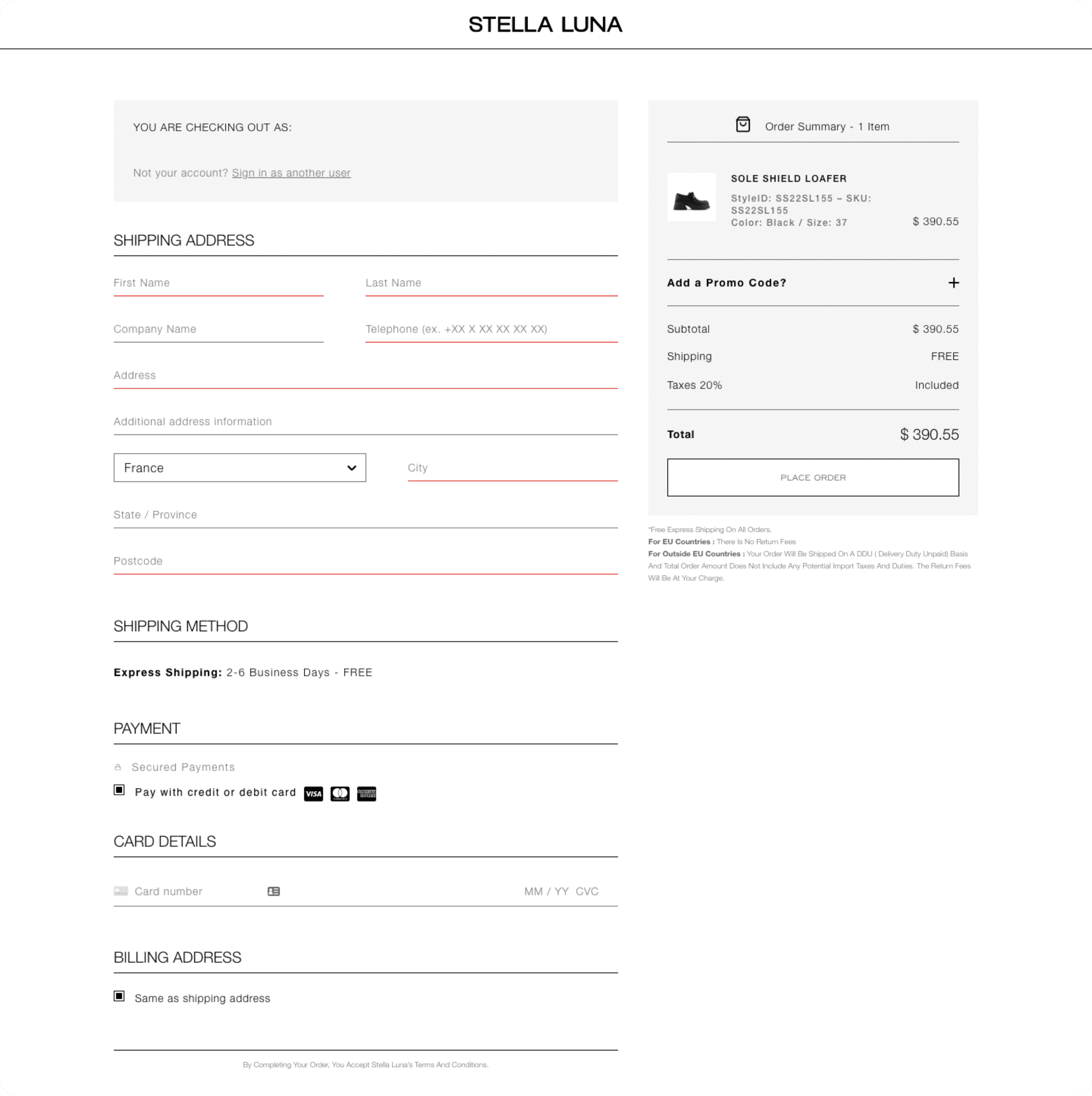
This is unlike many brands out there that require users to continue navigating to a bazillion of different pages before getting to place the order.
Best Practices for eCommerce Checkout
- Keep the process short and sweet. You can combine pages into a single-page check-out and use 2-column layouts to make it look shorter.
- Label input fields clearly to prevent misunderstandings (e.g. wrong address or wrong checkbox).
- Make sure customers see a Confirmation Page BEFORE and AFTER checking out to confirm they have placed the right order.
6. Make Opening an Account to Check-out Optional
Opening an account on a website knowing you will be a frequent visitor and make repeated purchases is a great time saver! It is also a great way of ensuring that customers get the best possible experience in the long term.
However, forcing everybody to create an account before processing their order is probably the most annoying thing you can do to potential customers. Not to mention an extra step they need to take before checking out is another chance for them to abandon the cart.
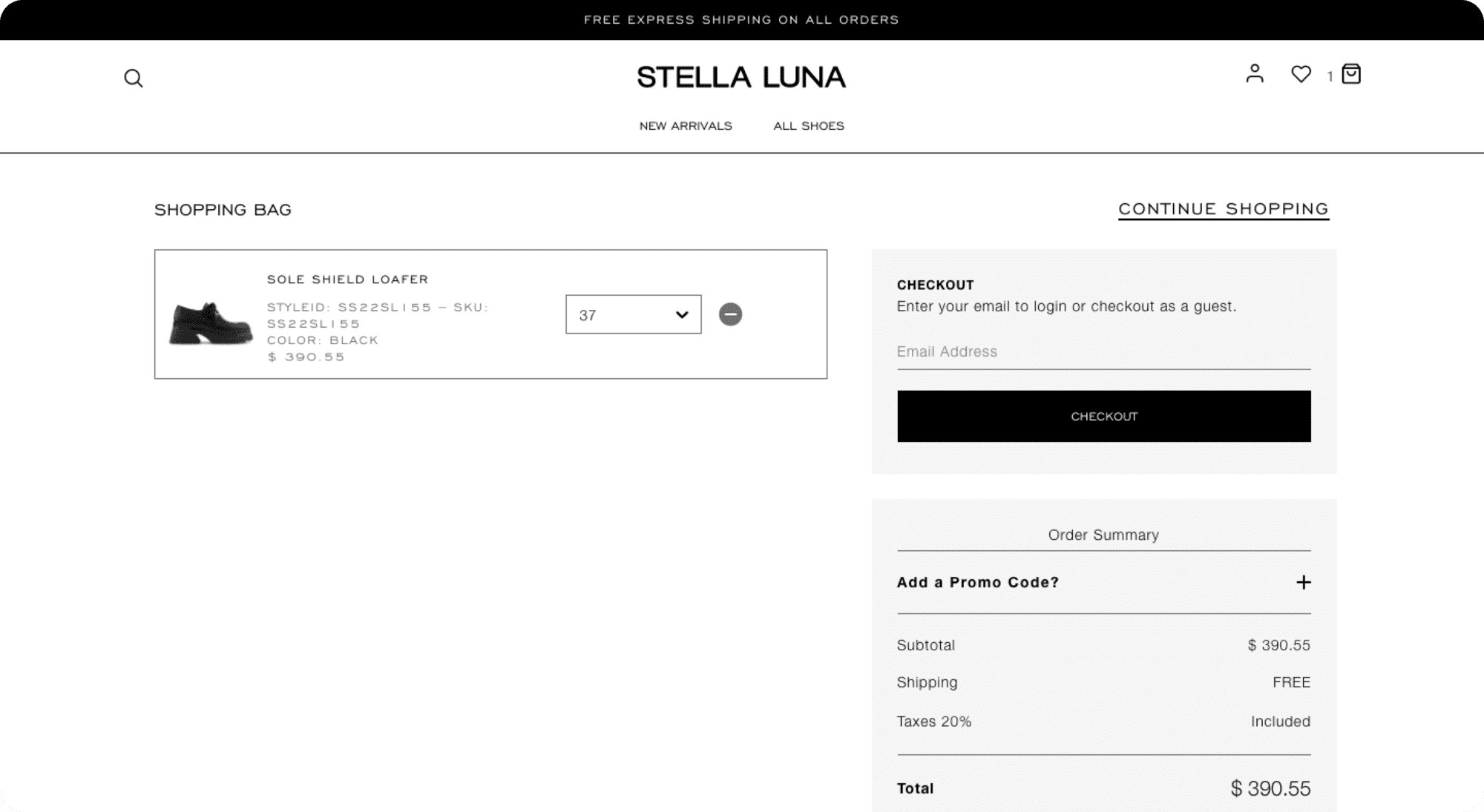
Therefore, if you do not want to risk losing business, Stella Luna is again a great example of how opening an account at check-out should be done.
When checking the Shopping Bag after adding the items they want, the user can either check out with an account or as a guest. The alternative option is optimized for those who cannot be bothered to create an account for a single quick purchase.
And, after the order has been placed, they also get the option to create one using the information they have already entered!
Another way to quicken the eCommerce sales process yet still allows you to obtain the user profile is by asking the user to log in via a third-party account instead. This is commonly done with either a Google or social media account.
In China, WeChat is the most popular mobile social media application. Therefore, many companies here, including global brands penetrating the Chinese market, allow users to log in with their WeChat profile instead of pushing them to create a new account.
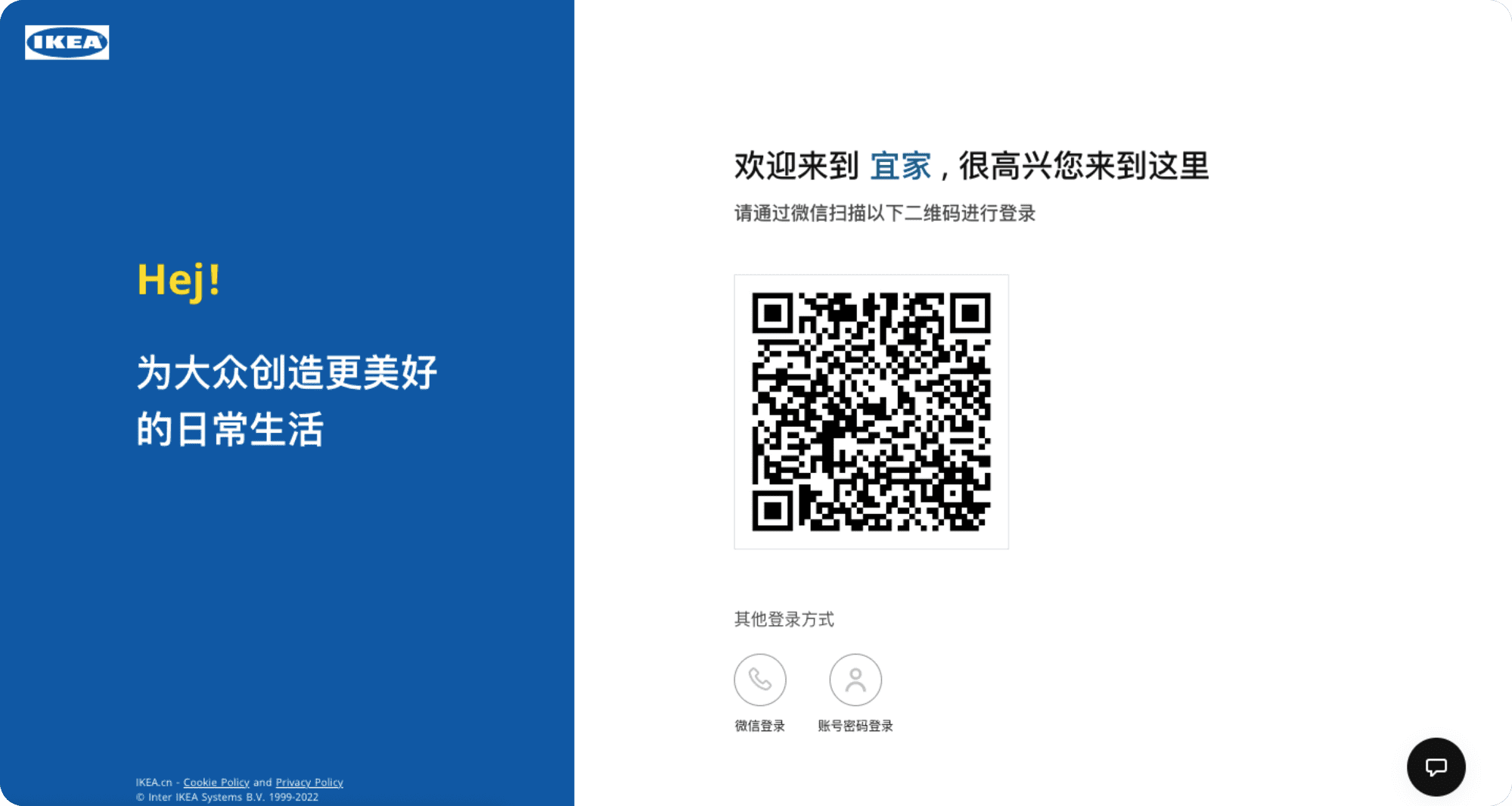
Some of ITC's past clients in the eCommerce space have also incorporated this on their eCommerce websites, namely IKEA and YSL China.
When clicking on this option, a QR code appears and users can scan it using the WeChat app on their phone. Next, a "Login" button will appear on their phone screen. By pressing on it, the eCommerce website will acknowledge that they are logged in and automatically direct them to the next step of the check-out process.
Best Practices for Customer Account eCommerce
- Give customers the option of creating an account after the order has been placed by asking if they would like to save their information for future purchases. The convenience adds value to their next visit and gives you the information you want without disrupting their shopping experience.
- If collecting information is not your main goal, give customers the option to check out as a guest.
- If registered accounts are important to your business, make the process as quick, easy, and unobtrusive as possible. For example, only ask the customers to create a password at the END of the checkout to access their account and see the status of their order. Or, allow customers to log in via a third-party account.
7. Provide a Good Range of Payment Options
Nowadays, all good e-Commerce sites offer an array of payment options to serve customers better.
Yet some sites still have unnecessarily limited options (just credit cards, but no PayPal, for example). This is inconvenient for customers and can quickly prevent a sale from taking place.
Now, this does not mean that you should add every payment method known to man to your website just in case someone happens to want to use it. Be strategic and think about what your customers' needs are and how they align with your business proposition.
If you are a small local delivery service, you could run your business perfectly fine taking payment on delivery. However, if you are a multinational company selling products on the more expensive side, this simply would not work.
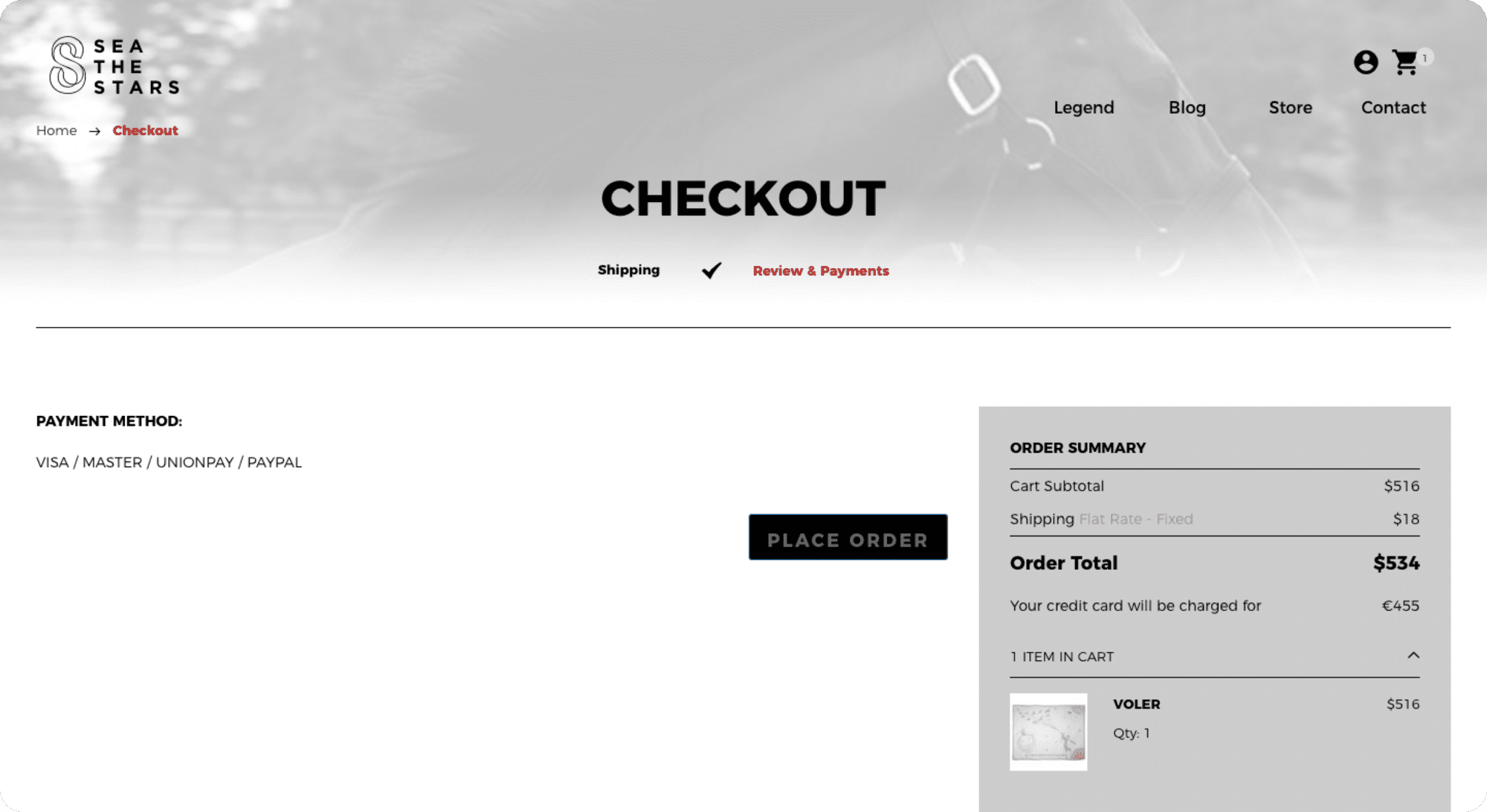
For example, one of our past clients - Sea The Stars - is an eCommerce business selling clothes, jewelry, and accessories. They ship worldwide, therefore, they also accept payments via PayPal aside from regular credit card charges.
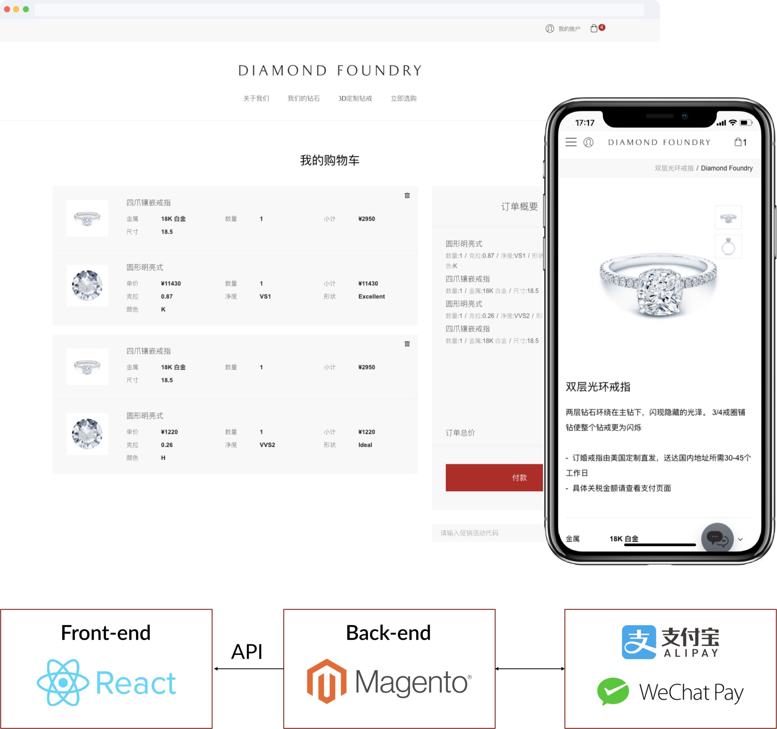
If your target market is in China where local digital wallets like Alipay and WeChat Pay are the norm, it is recommended to integrate these third-party payment methods into your e-Commerce website. And this was exactly our suggestion and recommendation for Diamond Foundry's website in China.
Particularly, for users who prefer Alipay or WeChat Pay, they can simply scan the valid QR codes displayed on the brand's website to make the payment on their mobile devices.
Recommendations for eCommerce Website Payment Methods
- Offer as many payment options as they make sense for your target customer, whether that is 2 or 10.
- Be upfront about what payment methods you accept from the beginning of the eCommerce sales process. There is nothing worse than getting to the last checkout step only to find out you won't be able to pay.
8. Make Contacting You a Breeze
One of the things that can make customers hesitant about buying from your e-Commerce site is the absence of basic contact information.
We all know how important contact forms are. And when it comes to online shopping, having the assurance that the store can be reached in case of any problems is crucial. Whether this means having a contact form, online chat, service hot-line, or something else, making it easy to find and use is a must.
For instance, the IKEA China website leaves all of its contact information on its Contact Us page, which can be found at the Footer of every page. Here, the customer can ask for support via their:
- Online service, which can be accessed by scanning the QR code
- Phone service
And those looking for IKEA business contacts can also find directions to navigate to the information they need.
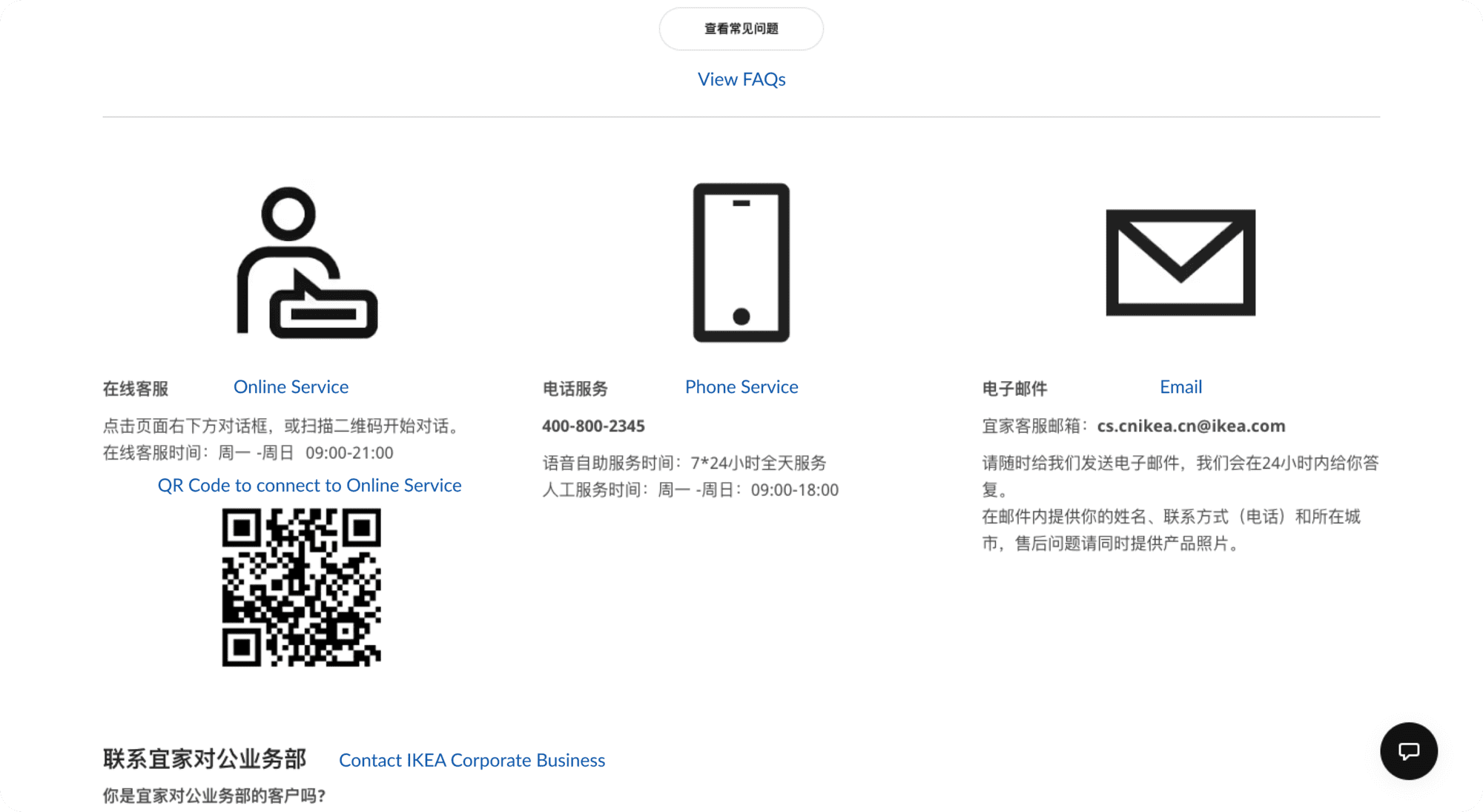
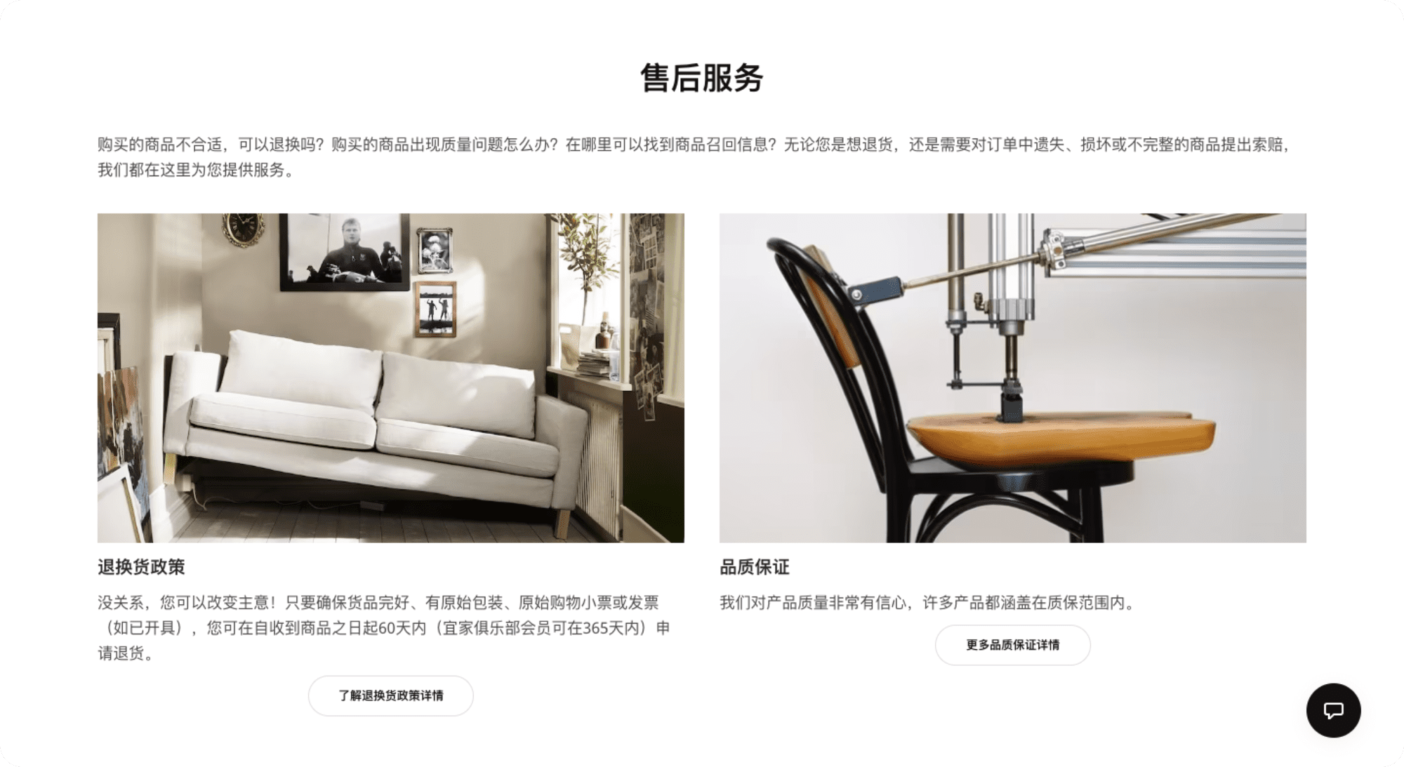
IKEA China also has a dedicated page for Frequently Asked Questions (FAQs) to address common concerns about Shopping, Payment, Delivery, Billing, and After-Sales Services.
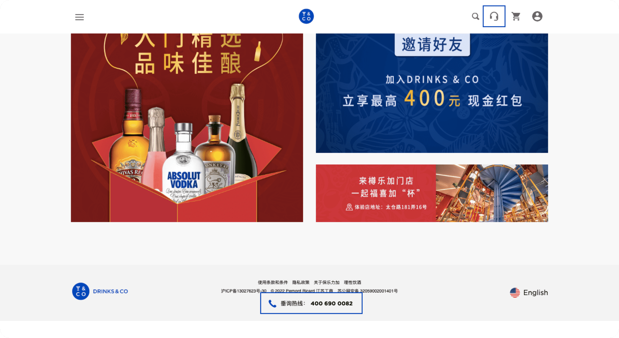
Another good example is Pernod Ricard's Drinks&Co China website. Other than the Enquiry Hotline that can easily be found at the bottom of the pages, users can also receive support from its Chat Bot. This feature is positioned next to the Shopping Cart icon on the Menu Bar.
Finally, in addition to common contact methods such as Hotline, email, and social media, you should provide localized solutions as well.
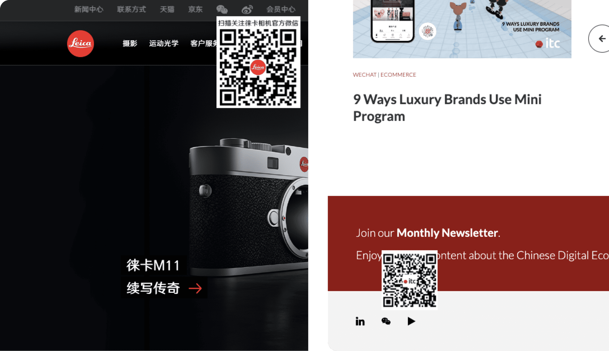
Although WeChat is not commonly used in most places in the world, it is the most popular messaging app in China. Therefore, many global brands here also leave the QR code leading to their WeChat Official Account on their website, including Leica China and us, IT Consultis!
As a result, this will not only enable customers to quickly reach you but also boost the number of touchpoints you can reach them going forward.
Best Contact Methods for eCommerce Website
- Remember that you are competing with established brands whose trustworthiness is already proven - think Amazon or, if you are in the Chinese market, Tmall. If customers can verify through your contact details that your company is just as trustworthy as your competitors, they will respond positively.
- Incorporate common contact methods such as Hotline, email, and social media, including local forms of communication (e.g. WeChat in China).
- Integrate a Live Chat function if it makes sense for your business. It's a great way for your potential customers to get help clarifying any concerns they might have and hopefully encourage them to make a fully informed purchase rather than "sleeping on it" and dropping it in the end.
- Having an FAQ page also goes a long way in putting customers' concerns at ease, as do reliable testimonials.
9. Make Store Policies Clear
Just as with contact information, having clear Store Policies and Terms and Conditions for purchase adds another level of trustworthiness to your eCommerce site.
This will give the customers much-needed peace of mind regarding what to expect post-purchase. Additionally, they can also prevent customers from becoming frustrated if something unexpected happens with their shopping. And, at the same time, it saves the company hours that could be wasted on unnecessary customer service.
Once again, IKEA China makes an excellent example of this! They have detailed pages for:
- Quality Assurance: Pointing out which product is covered under warranty
- Return Policy: Declaring the frame of time, type of product, and the method to return one after purchase
- Recall Announcements: Notifying customers of products that IKEA China is recalling due to certain risks and issues
- IKEA Shopping Card Inquiry: Stating precisely the rules and precautions that consumers should keep in mind when using the IKEA Gift Card and Return Card
How to Improve the Policies for eCommerce Websites
- Make everything clear in your store policy, including warranties, exchanges, returns, refunds, time applicable, procedures, etc.
- A detailed store policy has to be easy to read and understand, not full of technical jargon.
- Avoid burying the links in your Footer written in a tiny font. Try to make them a part of your checkout process or add them to your Product pages.
10. Include A Store Locator (if you have a store)
Having a great e-Commerce should not just increase website traffic. It should also be utilized to increase foot traffic to your brick-and-mortar stores as well. And a store locator does just that!
It allows potential customers to find your nearest physical store and check the quality and performance of the products in real life before making the final purchase. Thus, this would clearly help you expand your business, facilitate O2O customer journeys, and optimize engagement in multiple touchpoints.
Store locators can come in the form of a Location page, listing all of your addresses and contact information. Some eCommerce sites may even go above and beyond with a search function and an interactive Location Map.
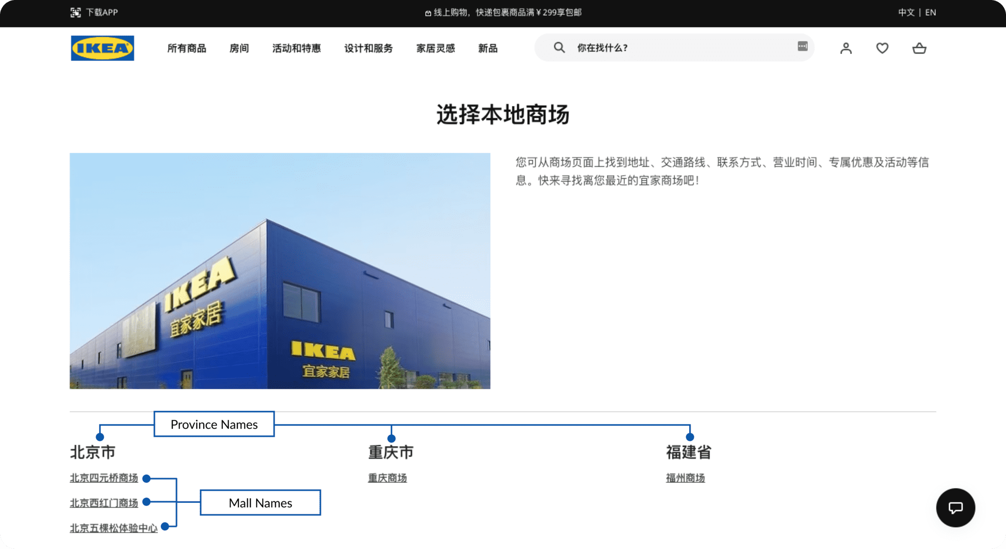
And, IKEA China is a prime example of the 1st type. Its page list all of the local malls categorized by provinces in China. Thus, the user can find the name of their province, then detect the nearest mall that has an IKEA store.
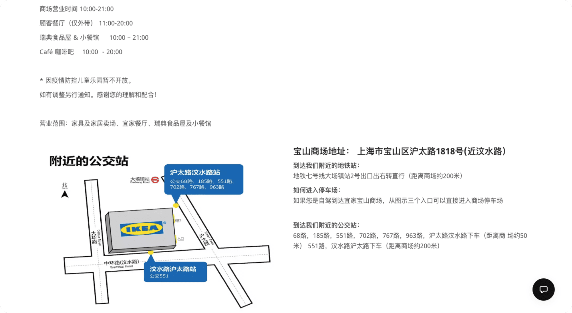
When clicking on one specific mall, via the navigations on top, they can check:
- The Store Information (including the business hours, address, traveling instructions, parking information, and more detailed information and recommendations for each service)
- The Promotions currently available
- The IKEA Club
- The Shopping Mall Restaurant
- The IKEA Corporate Business Department (for business clients)
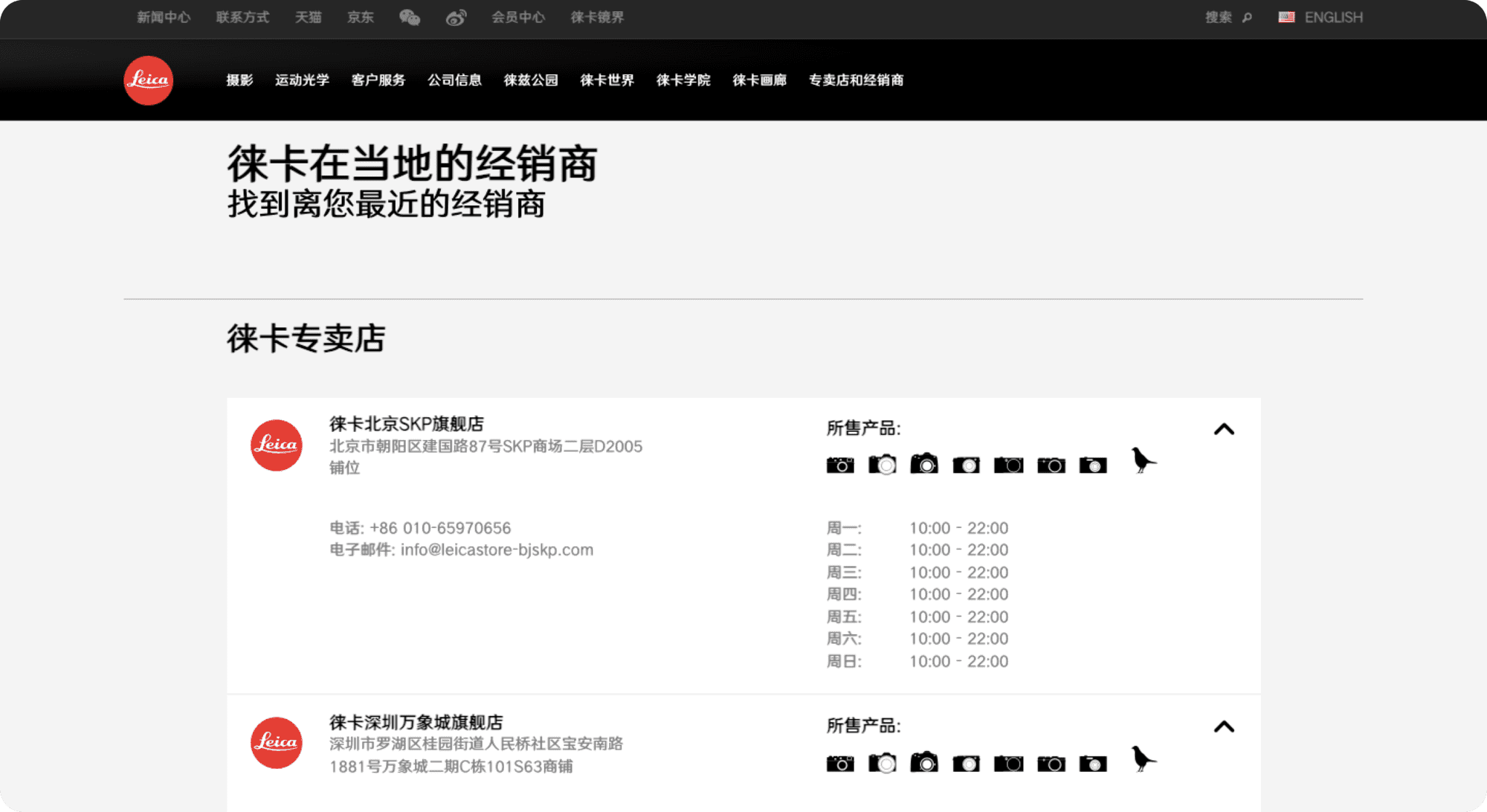
Another instance is the Leica China website. On its Dealer Locator page, aside from the address, contact information, and opening hours of each Leica store, users can also tell which product is available at which store by the intriguing simplified icons on the right.
On the other hand, the English version of the Leica eCommerce website is the perfect example of the 2nd type! Its Dealer Locator page features:
- A search function
- Filtering systems by products and store types
- A list of stores
- An interactive map that can detect the dealers near you if you enable Location permission for the website
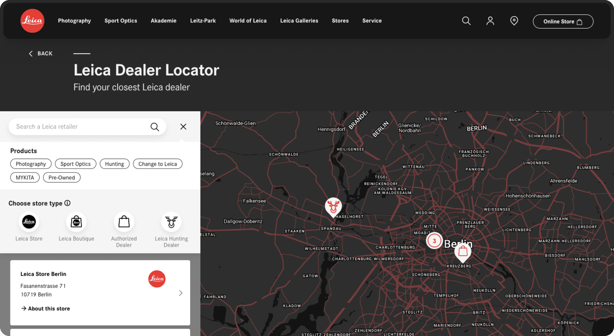
The page is well-organized and easy to navigate and use, facilitating the users' move from online to offline (O2O).
How to Increase Foot Traffic through Your Website
- Make sure the store location is easy to find - either on your Contact Page, Footer, or on its own page with easy access from the Navigation Menu.
- Include at least your address and contact number. Having store opening hours are a plus too!
- If you have multiple locations, include a map so that visitors can easily plan their routes to your store.
11. Optimize for Multiple Devices
According to Statista, there were over 4.3 billion unique mobile Internet users in the world in 2021. This suggests that over 90% of the Internet population went online using a mobile device. And this figure will only continue to grow even further.
Furthermore, if you are trying to target the Chinese market, know that mobile penetration here is not only high but also deep. Thus, this has immensely affected how eCommerce in China is shaped. In fact, around 84% of Internet users here use mobile devices to go online shopping in 2021!
That's why you need to optimize your eCommerce website for all possible devices that your target market may likely access. This way, the users can have a positive user experience regardless of where they are viewing your site, a desktop, tablet, or smartphone.
The Pernod Ricard Drinks&Co website is a rather straightforward example that small business owners with small inventories can easily follow.
On the desktop view, the user can find all of the basic functions on the Navigation Bar placed at the top of the page.
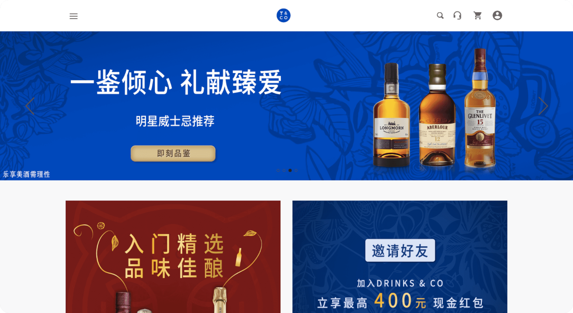
However, when accessing via a smartphone's web browser, the e-Commerce website appears to be more similar to an application. The Navigation Bar is placed at the bottom of the page instead.
This position ensures that the icons are not unflatteringly squeezed into the Top Bar. And ultimately, it maintains functionality while preserving the simplistic aesthetics of the Drinks&Co platform.
How to Optimize Website for Different Screen Sizes
- Adaptive Web Design: You can design adaptive fixed layouts for the most common screen sizes. The website will then automatically select the best fitting one for each user's screen. However, they may still miss by a long mile for very uncommon screen sizes.
- Responsive Web Design: You can create a dynamic layout that can be optimally rearranged to fit any screen size. However, the designing process will take a lot more time and effort to pull off. And there is still a chance that the content is not presented properly.
Check out this list of the best website designs for more inspiration.
To Wrap Up - How to Improve eCommerce Website
There you have 11 tips on how to plan an eCommerce website. These will definitely help your business be on the right track from day one.
However, keep in mind that this is just one aspect of the ongoing e-Commerce business process. To drive your conversion rate even higher and increase online sales, you need to know your market, devise solid strategies for eCommerce, and monitor and adjust every step of the way.
Want more advice about your eCommerce business in China and Asia? Send IT Consultis a message and our experts will get back to you shortly with the latest information!
FAQs
What Top 5 Features are A Must for any e-Commerce Site?
- User-friendly navigation and filtering system and/or search function
- Large high-quality and accurate product images
- Detailed and SEO-friendly product descriptions
- Multi-device optimized web design
- Secure and effortless checkout process
Which Technology is Best for eCommerce Website Development?
Depending on your eCommerce needs, one platform may be more suitable than others. You can follow this quick list to get a general picture:
- Shopify: For startups and SMEs with a low budget and preference for themes
- Magento, Oracle, Big Commerce: For larger enterprise-level companies
- Salesforce Commerce: For more advanced eCommerce needs, especially in personalization
If your target market is in China, your choices are more limited. However, you will still have access to your best bet - Magento. For more information, check out why you should utilize Magento in China.
Is it Hard to Build an eCommerce Website?
The answer depends on your business needs and the complexities of the site you have in mind. The more you demand, the longer and more complicated it is to develop. If you are just starting out, nowadays, there are plenty of themes on sites like Shopify to work with and start generating online revenue.


