
This article breaks down what “digital luxury” means in WeChat Mini Program design and how brands can build a true white‑glove experience on a small screen.
It explores WeChat Mini Program luxury UX design through five key lenses, so marketing, branding, and UX teams can create journeys that feel as high‑touch as a physical flagship store.
Executive Summary:
1. Digital luxury in WeChat Mini Programs means creating a calm, high-touch “brand sanctuary” inside a fast, utility-driven super app, where the experience feels as considered as a flagship store rather than a crowded e-commerce template.
2. Visual curation and use of white space are the foundation of luxury UX, shifting from dense product grids and promotions to editorial layouts, macro product imagery, and restrained interfaces that signal exclusivity and confidence.
3. Tactile micro-interactions and motion design give digital materials a physical, premium feel, using subtle transitions, depth, and feedback to make each tap feel intentional, polished, and aligned with the brand’s world.
4. Invisible services in the private domain (WeCom, VIP rooms, clienteling, post-purchase care) turn a Mini Program into a relationship engine, quietly connecting users to advisors, exclusive communities, and tailored benefits without overwhelming them with noise.
5. Performance is the ultimate layer of luxury UX, where fast loading, smooth flows, and low-friction journeys ensure that every interaction feels effortless, reinforcing trust and the sense of a truly “white-glove” digital experience.
Table of contents
- The Paradox of Digital Luxury Inside WeChat Mini Program
- 1. Visual Curation: From Crowded Shelves to Digital Editorial Space
- 2. Giving Pixels a “Material Feel” Through Micro‑Interactions
- 3. Invisible Thresholds and White‑Glove Service in the Private Domain
- 4. Storytelling Over Transactions: Calming the Mind Before the Cart
- 5. Performance as the Ultimate Layer in WeChat Mini Program Luxury UX Design
- To Wrap Up
The Paradox of Digital Luxury Inside WeChat Mini Program
WeChat Mini Programs were born to be efficient tools: instant entry through WeChat, no download, quick task completion. In a world of fragmented attention, most users care about one thing above all else: “Can you help me get what I want, fast?”
Luxury, however, has always played a different game. High-end brands are built on distance, dream-making, and exclusive privilege. The boutique door feels slightly heavy. The sales advisor doesn’t rush. Time slows down on purpose.
When luxury brands move into WeChat Mini Programs — a billion‑user “public square” optimized for speed and utility — the default instinct is to copy generic e‑commerce templates:
- Pop-ups shouting for attention
- Floating shopping carts
- Aggressive “Buy Now” CTAs
- Product grids packed into every pixel
The result? The quiet, composed, almost ceremonial feeling of an offline flagship store evaporates. On a 6‑inch screen, the brand suddenly feels like just another loud online supermarket.
True digital luxury in a WeChat Mini Program is not about upgrading to a nicer serif font or uploading a few glossy campaign visuals. The real challenge is more fundamental:
“How do we carve out a calm, editorial, high-touch brand sanctuary inside one of the noisiest super apps in the world?”
In the upcoming sections, we will look at WeChat Mini Program luxury UX design through five lenses:
- Visual curation: How editorial restraint creates a sense of privilege
- Tactile micro‑interactions: How motion and depth give digital materials a “feel”
- Invisible threshold services: How to embed white‑glove care into the private domain
- Narrative psychology: How storytelling and copy calm purchase anxiety
- Performance: Why it is the most luxurious layer of all
1. Visual Curation: From Crowded Shelves to Digital Editorial Space
If the ultimate goal of a typical eCommerce WeChat Mini Program is efficiency (show as many stock keeping units (SKUs) and promotions as possible, as quickly as possible), then the visual goal of a luxury WeChat Mini Program is immersion.
In a luxury context, we are often willing to sacrifice a bit of efficiency to create moments of appreciation and lingering. On WeChat’s limited screen real estate, this “luxury feel” often comes not from adding more, but from radical subtraction and careful curation.
1.1 Negative Space as a Privilege
Open a standard e-Commerce WeChat Mini Program, and you’ll usually see the first screen overloaded with carousels, button clusters, waterfall product grids, and floating promo widgets and coupons.
This is the visual expression of traffic anxiety: “If we don’t show it now, they’ll never see it.”
By contrast, high-end luxury eCommerce Mini Programs dare to leave the screen almost “empty”:
- A single hero product with room to breathe
- A macro close‑up instead of a full catalog
- Large areas of negative space acting like a digital gallery wall
The message to the user is clear: “This one thing deserves your full attention.” Low information density becomes a quiet signal of status.
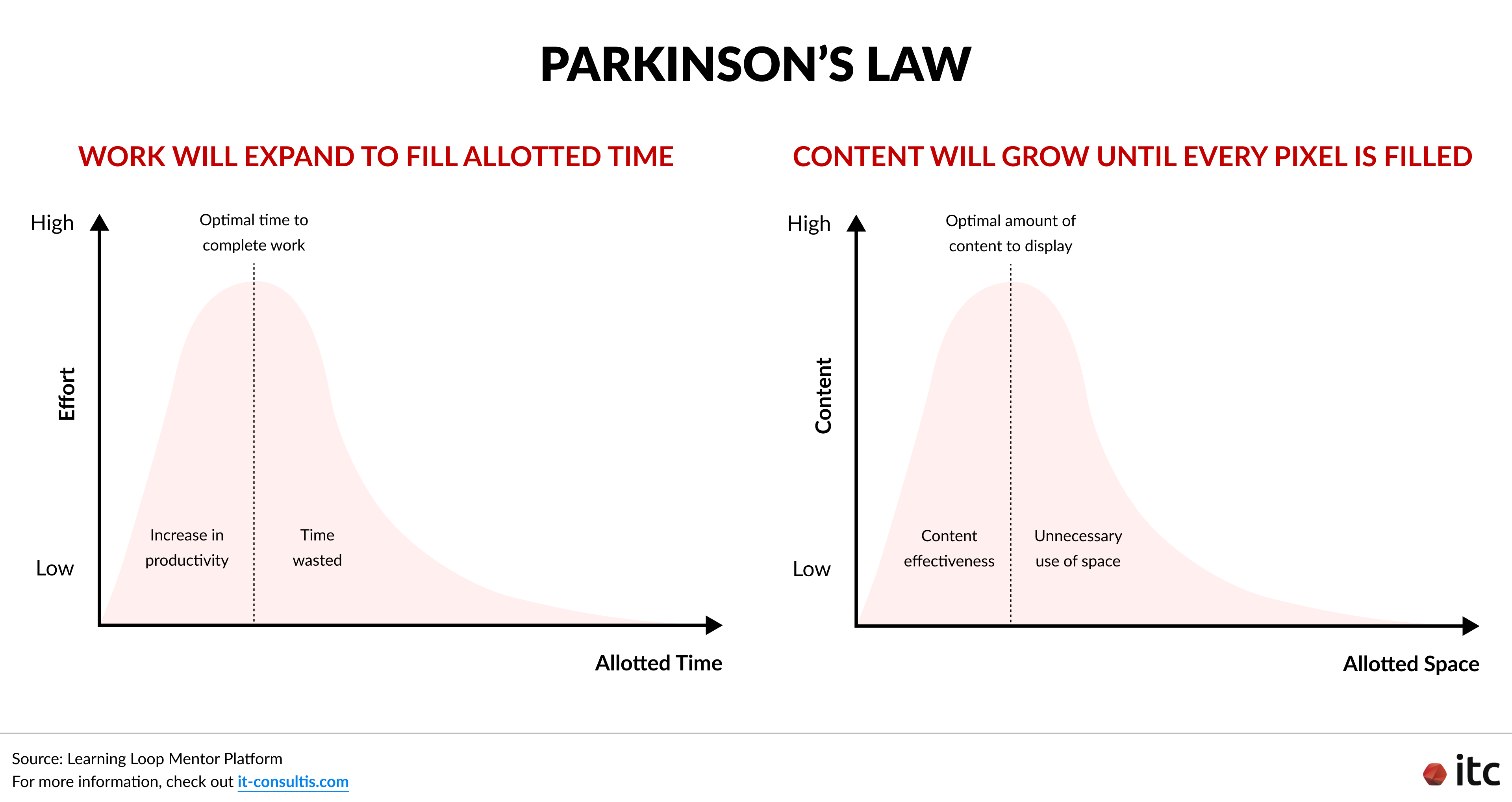
In UX terms, it’s a deliberate pushback against Parkinson’s Law: work expands to fill the time available, and on interfaces, content tends to grow until every pixel is filled.
Luxury Mini Programs resist this, treating space itself as a privilege.
Some concrete examples:
In the Glenfiddich Mini Program, dark, liquid‑like negative space evokes whisky glimmering in a glass, making the product feel almost like it’s floating in a gallery.
In Chanel’s retail Mini Program, large blocks of black negative space plus cinematic macro close‑ups replace the usual wall of product shots.
The design principle is simple: Don’t dump all information at once. Lead with the most essential, emotionally resonant content. Reveal details progressively as interest deepens.
For WeChat Mini Program luxury UX design, this means:
- The initial viewport before scrolling should show one strong visual or story moment, not five competing banners.
- Only essential actions should appear first; everything else should be placed below the scroll or in secondary layers.
- A clear visual hierarchy guides the eye so users immediately know where to focus.
- Story or editorial content comes first, with the option to jump into product lists once the user is emotionally hooked.
1.2 From Rigid Grids to Fashion‑Magazine Layouts
WeChat’s native UI components encourage regular, symmetrical layouts. That works for tools and utilities, but sophistication often comes from breaking the expected order.
Luxury WeChat Mini Programs frequently abandon cookie‑cutter two‑column waterfalls and instead borrow from editorial design and fashion magazines:
- Asymmetrical text‑image compositions
- Oversized imagery breaking out of the grid
- Intentionally cropped visuals, using negative space as a framing device
- “Shop the look” layouts that feel like spreads from a lookbook, not rows of SKU cards
This shift from “warehouse shelves” to “editorial spreads” helps blend storytelling with commerce, slow the scroll just enough for appreciation, and reposition the Mini Program as a brand experience, not just a transactional catalog.
The trade‑off is clear: you may show fewer products per screen, but each product carries more narrative weight and emotional value.
For instance:
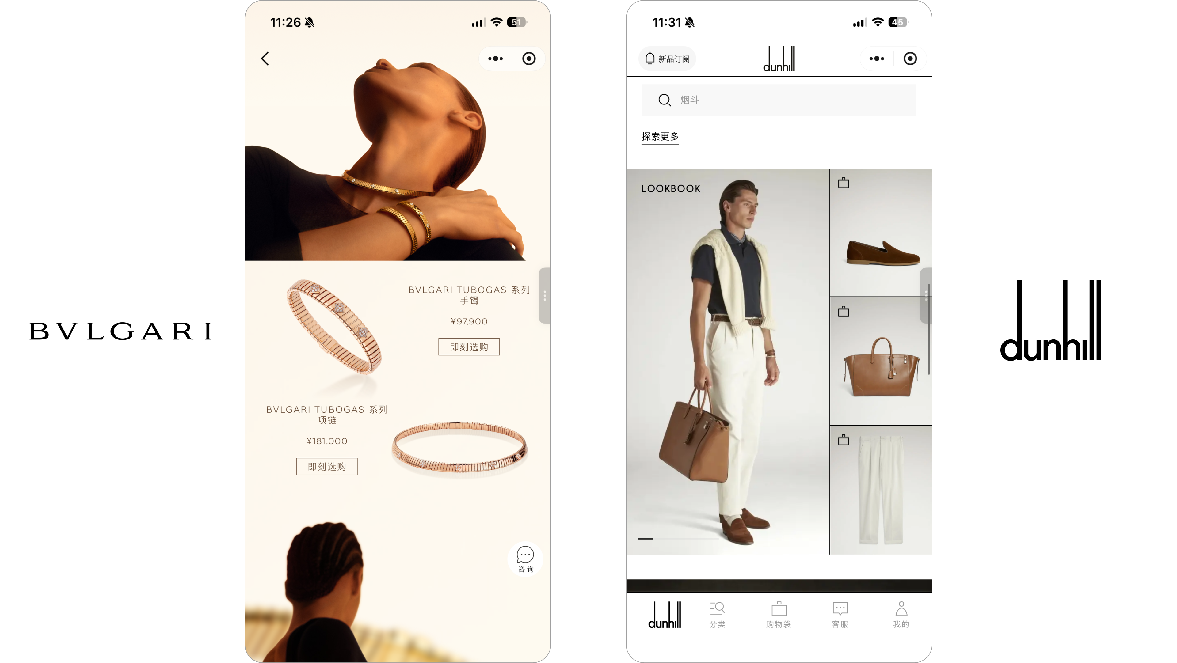
- Bulgari Jewellery Mini Program uses background removal or full-screen images that break physical grid boundaries creates a strong sense of spatial extension and visual impact.
- Dunhill eCommerce Mini Program’s “Shop the Look” (scenario-based shopping) uses clean layouts, but demands high-quality brand assets — uniformly lit still-life photography and strictly consistent color tones.
1.3 Typography that Resists System-Default Mediocrity
Typeface is one of the most powerful carriers of brand personality. Yet WeChat Mini Programs default to system fonts like PingFang or San Francisco — perfectly functional, but visually anonymous for haute couture, fine jewellery, or heritage maisons.
Under performance constraints, luxury brands still have options to elevate typography within Mini Programs:
- Use custom brand fonts for key headlines by rendering them as images, where the content rarely changes
- Combine system fonts with considered hierarchy (weights, sizes, and line spacing) to create rhythm
- Keep text blocks short (3–4 lines), with generous spacing so sections read like poetry rather than manuals
Done well, typography makes even simple layouts feel bespoke and intentional — a subtle, but crucial layer of “luxury feel” in WeChat Mini Program UI/UX.
2. Giving Pixels a “Material Feel” Through Micro‑Interactions
WeChat’s default page transitions are simple slides. Functional, but flat. Luxury brands, however, rarely want their digital experiences to feel purely 2D.
2.1 Parallax and Depth: Turning Scrolling into Exploration
One powerful technique in luxury WeChat Mini Program UX design is parallax scrolling — where background imagery moves at a slightly different speed from foreground text or product cards.
When executed carefully, parallax:
- Creates a sense of visual depth, like peeking through a window
- Makes static images feel as though they’re subtly breathing
- Encourages users to “drive” the story with their fingers – each swipe reveals a new layer
Glenfiddich Mini Program’s simple sliding journey turns reading into exploring — users swipe through the brand history like a storybook.
Apple uses parallax scrolling to stage immersive product presentations, with layered motion guiding the eye naturally toward key product features as users move through the page.
The key is restraint:
- Animations must be buttery‑smooth, never jittery
- Motion should support storytelling, not become a gimmick
- Interactions should feel intuitive, not like hidden puzzles users must “solve”
Where performance or device constraints are a concern, consider lighter‑weight illusions of depth:
- Subtle hover‑like states on tap or long‑press
- Micro‑scale changes in shadow and elevation
- Gentle easing curves on carousels and transitions
Even minimal motion can make a digital surface feel more like a crafted material and less like a flat template.
3. Invisible Thresholds and White‑Glove Service in the Private Domain
Luxury sales (clienteling) have always been about human relationships: client advisors who remember preferences, invite‑only events, VIC rooms behind unmarked doors.
In WeChat, this translates into how Mini Programs quietly connect to WeCom, private traffic, and offline boutiques, without breaking the sense of calm.
3.1 WeChat Mini Program x WeChat ecosystem Integration that Whispers, not Shouts
“Contact customer service” call-to-actions (CTAs), floating chat bubbles, and persistent pop‑ups may work for mass retail, but they instantly cheapen a luxury experience.
Instead, think of “Contact Client Advisor” as a discreet business card placed at exactly the right touchpoints:
- At the bottom of a product detail page, after key storytelling and product information
- Near high‑consideration features (e.g., customization, rare materials, made‑to‑order pieces)
- On the My Account or Find a Store page as a stable, reassuring entry point
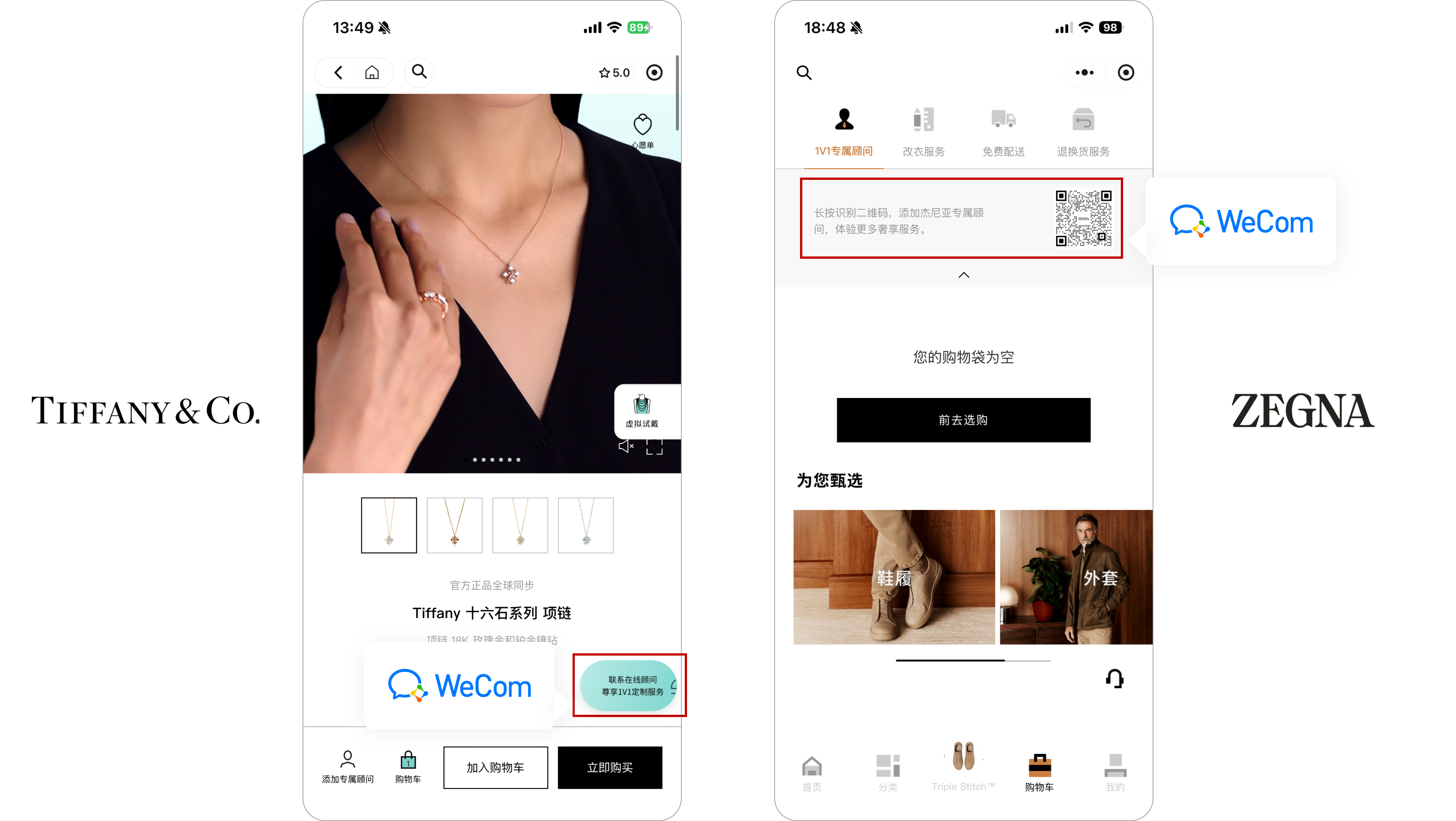
Tiffany and Zegna add a WeCom entry in the bottom tab of the Product Detail Page, at the top of the shopping cart, and on the My Page screen.
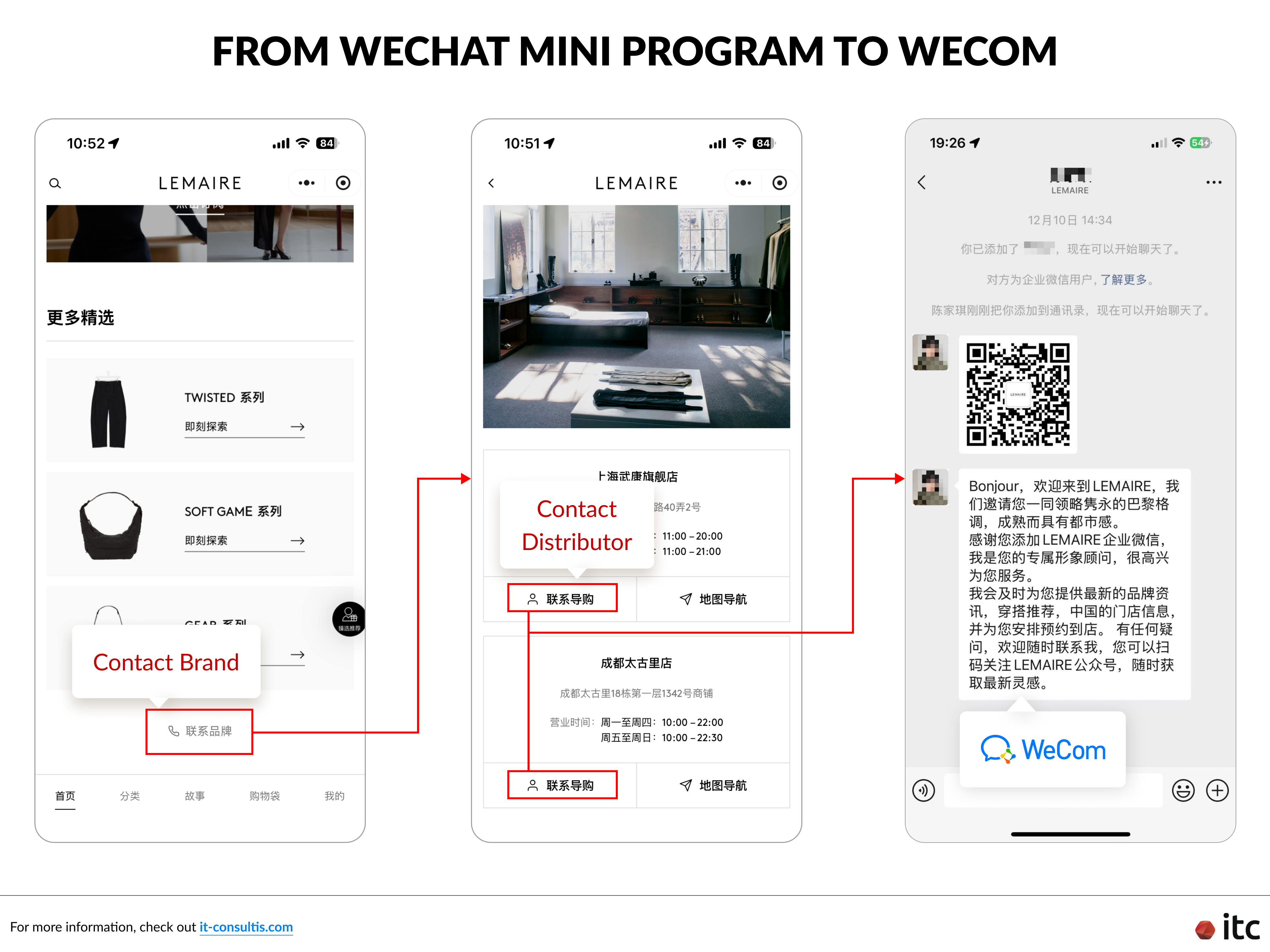
Lemaire adds a “Contact Offline Store” entry at the bottom of the homepage, seamlessly routing online and offline traffic into WeCom to optimize service quality and deliver an enhanced customer experience.
The positioning signals: “Someone is here for you – but only when you want them.” It feels like stepping aside with an advisor in a boutique, not being chased by a call centre.
3.2 Private Salons: Personalization and VIC‑Only Experiences
The killer feature of WeChat Mini Programs is their tight integration with WeChat IDs, which enables truly personalized, high-end experiences throughout the WeChat ecosystem and even offline retail.
Brands can design diverse play modes and invite-only journeys, such as:
- Showing customized welcome messages and AI-powered product recommendations based on each user’s profile, past behaviors, and purchases
- Allowing only whitelisted VIC users to access exclusive Mini Program pages shared by their dedicated client advisor via WeCom
- Launching VIC-only WeChat Mini Programs (including luxury loyalty Mini Programs) that sit entirely apart from the public experience
The goal is to make the Mini Program feel less like a generic shop and more like a “digital private salon” — personal, quiet, and relationship‑driven.
3.3 Designing Seamless Online‑to‑Offline journeys
Luxury purchase journeys are rarely purely digital. Custom shoes, haute joaillerie, leather care, fitting sessions — many key moments still happen in the boutique.
Effective WeChat Mini Program luxury UX design, therefore, needs to:
- Offer Online-to-Offline (O2O) CTAs like “Book a boutique appointment” or “Book exclusive leather care” directly from the Product Detail Page
- Use location (with permission) to suggest the nearest flagship store or known advisor
- Connect bookings to WeCom so advisors can follow up personally
The ideal journey looks like this: discovery begins online, the relationship is deepened offline, and WeChat seamlessly connects the two worlds in the background.
4. Storytelling Over Transactions: Calming the Mind Before the Cart
Luxury doesn’t just sell products. It sells history, craft, and cultural capital.
4.1 From Digital Manual to Brand Biography
Instead of jumping straight into feature lists and bullet‑point specs, WeChat Mini Programs for luxury brands should reserve prime real estate for story content:
- Short full‑screen videos that show materials and craftsmanship in motion
- Editorial sequences explaining the origin of a motif, a rare leather, or a master artisan’s technique
- Immersive narratives around capsule collections, archives, or celebrity collaborations
The structure might look like this:
- Story first – material, place, craft, inspiration
- Then product – specific pieces that embody that story
- Then transaction – sizing, details, and checkout options
By the time the user sees the price, they have already absorbed the why. Higher price points no longer feel like arbitrary numbers, but like a natural extension of the story they’ve just read.
Product storytelling on Loro Piana’s WeChat Mini Program
4.2 UX Copy that Eases Purchase Anxiety
Words matter. Common phrases in mass e‑commerce, such as “Buy now”, “Only 2 left”, “Add to cart now”, and “Flash sale ends in 00:05:12”, can sound jarring and cheap in the luxury context.
Luxury copy should instead carry a tone of composed confidence – “we are not short of customers.”
Consider swapping:
- “Contact customer service” → “VIP Service” or “Contact Client Advisor”
- “After‑sales service” → “Exclusive Care” or “Book Maintenance”
- “Limited-time deal” → Wording that highlights rarity and curation, not panic and fear of missing out (FOMO)
The psychological shift is powerful: from “I’m spending money” to “I’m investing in something crafted for me.”
4.3 White Space as Narrative Punctuation
In long‑form scrolling experiences, dense text quickly becomes visual noise. As in Part 1’s discussion of visual curation, line breaks and breathing room are not just aesthetic choices — they’re narrative tools.
- Keep paragraphs short; let each idea sit in its own block
- Pair a few carefully chosen brand phrases with strong macro imagery
- Use section breaks and micro‑headings so users can skim, pause, and re‑enter easily
The ideal effect: reading feels like drifting through a beautifully paced editorial, not fighting through a product manual.
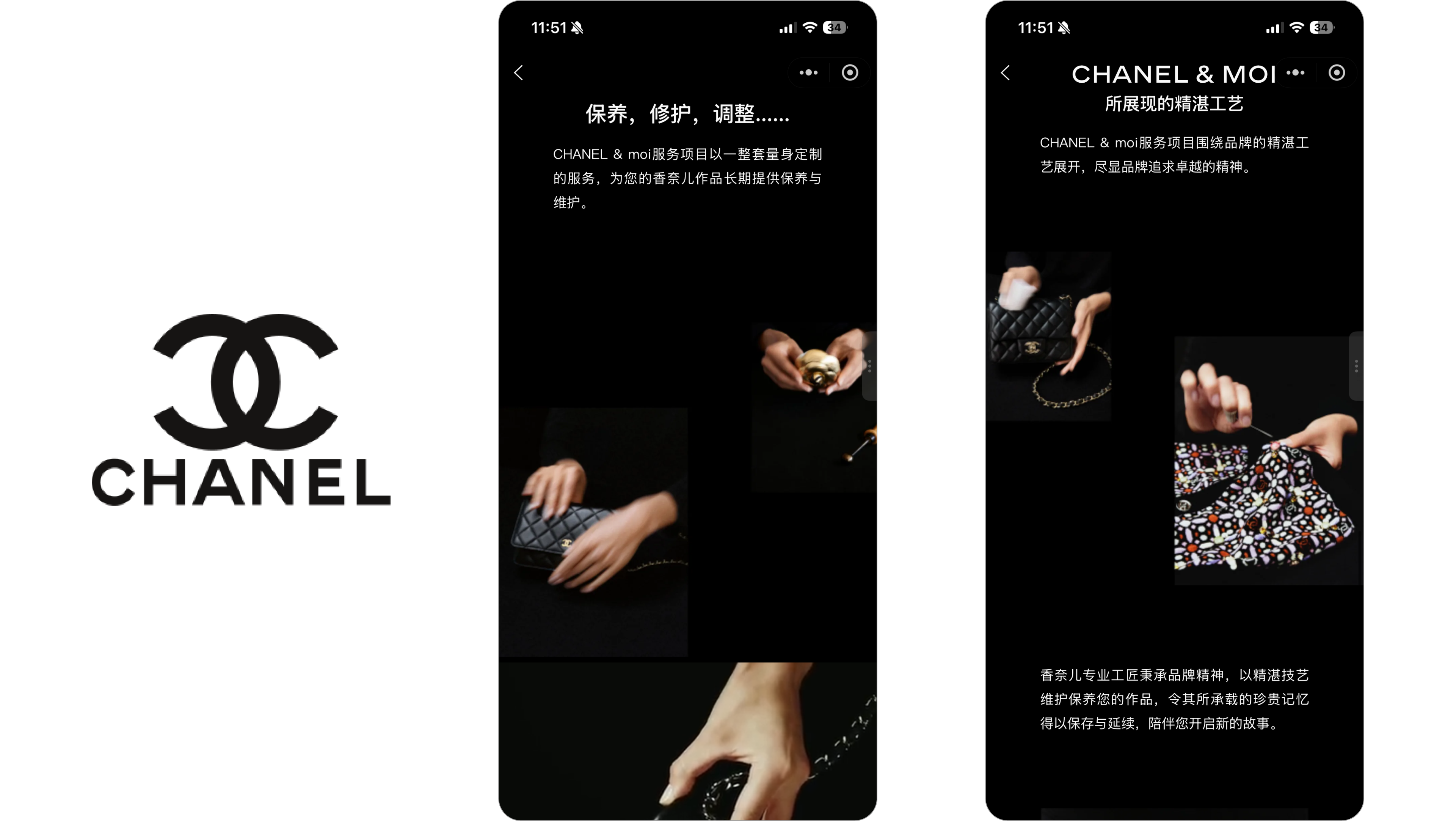
Effective line breaks and interesting image layouts on Chanel’s Mini Program
5. Performance as the Ultimate Layer in WeChat Mini Program Luxury UX Design
After we’ve crafted magazine‑like layouts, precise damping curves, invisible thresholds, and dream‑making copy, one foundational layer remains: raw performance.
In the digital world, zero perceived latency is the most absolute form of luxury.
No matter how sophisticated the design, if images stall on loading, scrolling stutters or drops frames, or interactions lag behind, the entire “premium” perception would collapse instantly.
For WeChat Mini Program luxury UX design, performance is not just a technical requirement – it’s a core design material:
- Optimize image pipelines (art direction plus smart compression, not compression alone)
- Preload key storytelling assets for seamless hero moments
- Collaborate tightly between design, development, and infrastructure to protect frame rate and response time
Within the small but powerful container of a Mini Program, true digital luxury emerges when visual restraint, tactile detail, invisible services, and high performance all reinforce each other.
The outcome for the user is a rare feeling on a crowded phone screen: “For a few minutes, I stepped into a different world – and it moved at the brand’s pace, not the platform’s.”
To Wrap Up
For luxury brands in China, WeChat Mini Programs are no longer just transactional touchpoints – they are a canvas for storytelling, service, and relationship-building. The most successful experiences treat every screen as part of a larger brand narrative.
Brands that get this right do not choose between aesthetics and performance. They design for emotional engagement first, and then make it effortless for users to explore products, speak to a client advisor, or book an in-store experience.
Over time, this mix of crafted UX, personalization, and WeCom-enabled service does more than drive single-session conversion: it reinforces positioning, justifies premium pricing, and deepens loyalty, especially with VICs.
At IT Consultis (ITC), we combine a dedicated Design Studio with in-house WeChat Mini Program development, so creative vision and technical execution stay tightly aligned from first concept to launch. Our team helps luxury brands:
1. Shape WeChat Mini Program UX that feels editorial, elevated, and on-brand
2. Design interaction, motion, and content flows specifically for Chinese users
3. Select the right technological foundation for China right from the start
4. Build and optimize WeChat Mini Programs that integrate seamlessly with the WeChat and WeCom ecosystems


