Blog/UX/UI Design/5 Ways Component-Based Design Empowers Web Development

Gone are the days when web development revolved around designing individual static pages. As website development is expected to become more user-centric and efficient, this calls for a flexible technical framework that can be more easily adaptable, scalable, and maintained.
That’s where component-based design comes in.
In this article, we’ll dive into 5 key reasons why exactly component-based design has been rising in popularity in recent years as the go-to design strategy for enterprises looking to scale and streamline their front-end web development.
Table of Contents
What is Component-Based Design?
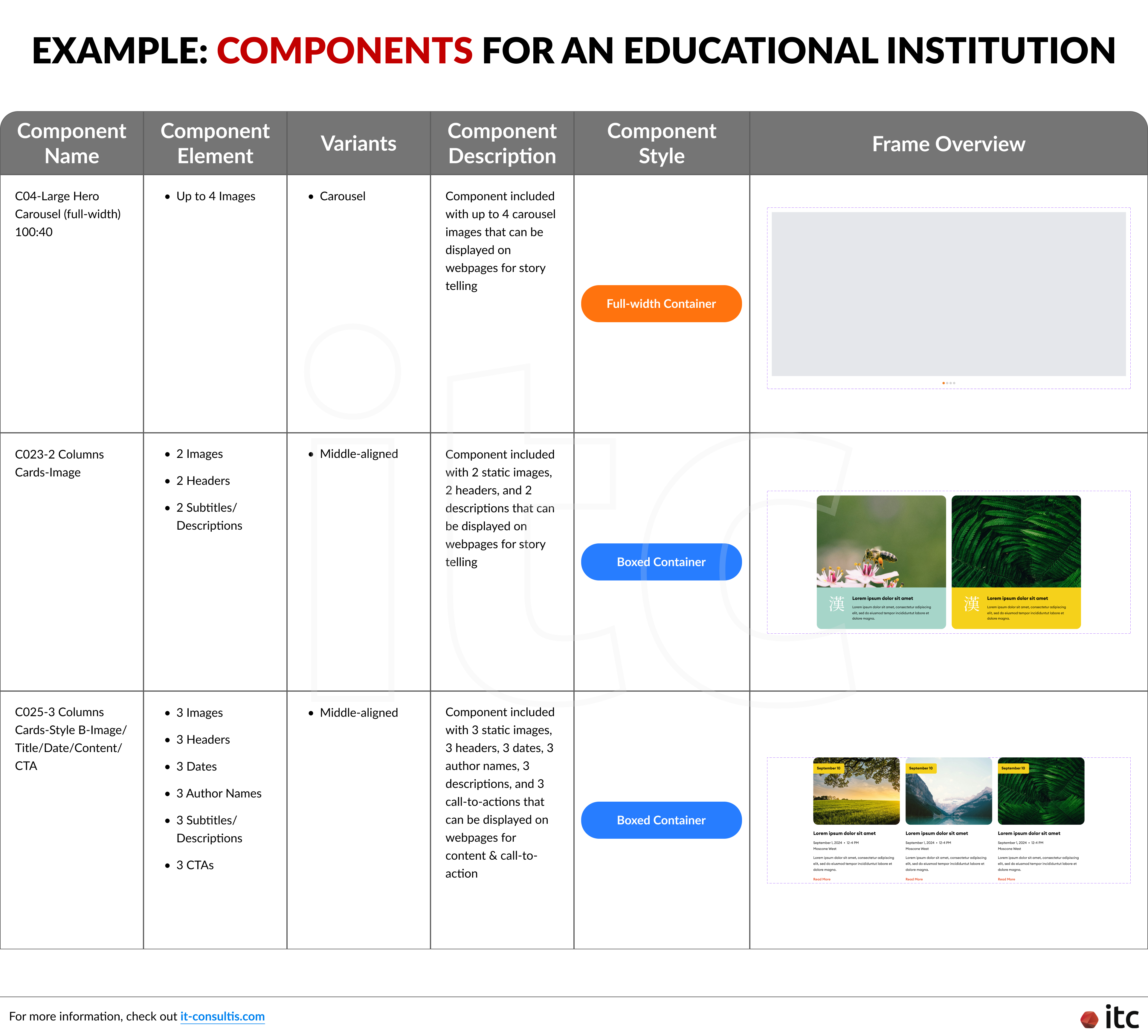
Component-based design in web development involves breaking down the user interface into a collection of smaller, and most importantly, reusable parts called components.
These components encapsulate specific functionality or visual elements, making the development process more modular and efficient. You would be designing the systems that the pages or screens are made of, instead of individual pages for websites, applications, Mini Programs, etc.
Think of component-based design as building blocks for your website or application. Instead of constructing everything from scratch each time, developers create these building blocks, which represent different parts of your site, like buttons, forms, or navigation menus. These blocks can be used and reused throughout the site, like LEGO pieces, saving time and effort.
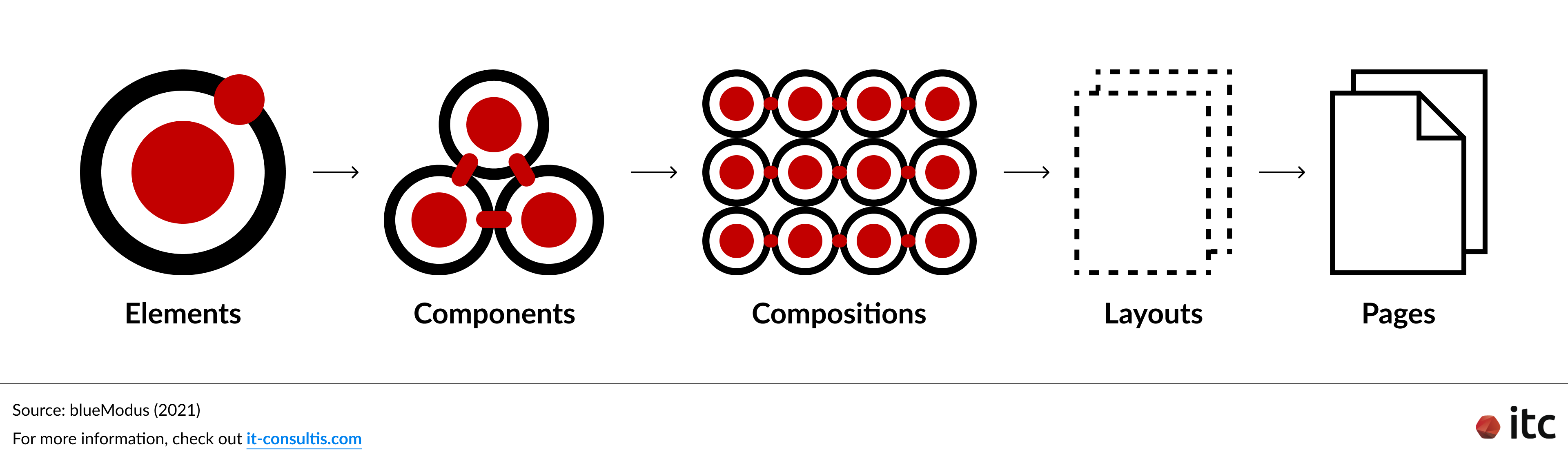
The component-based UI design process is broken into manageable:
- Elements: Basic building blocks like buttons, inputs, and dropdowns.
- Components: A component can be anything that uses at least a few elements.
- Compositions: Groups of components forming larger functional units.
- Layout: Arrangement of compositions to create cohesive pages.
- Pages: A collection of components and compositions (may include one-off page-level definitions).
Page-Based Design vs Component-Based Design: What’s the Difference?
In page-based design, websites are built as a collection of individual pages, each with its own layout and structure.
Developers typically create each page separately, duplicating code for common elements like headers, footers, and navigation bars.
This approach often leads to redundant code and makes it challenging to maintain consistency across the site. The common page-based design process usually involves the following steps:
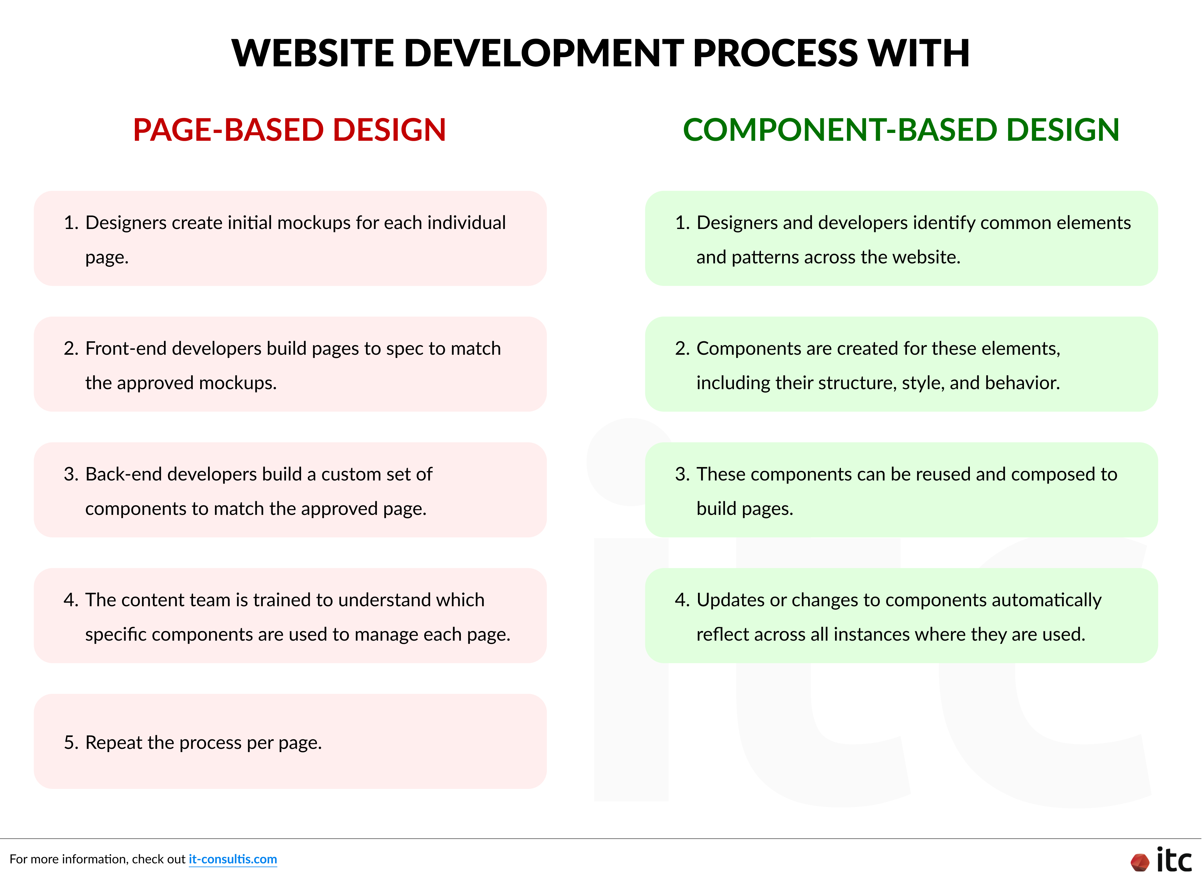
- Designers create initial mockups for each individual page.
- Front-end developers build pages to spec to match the approved mockups.
- Back-end developers build a custom set of components to match the approved page.
- The content team is trained to understand which specific components are used to manage each page.
- Repeat the process per page.
While this process often works fine on smaller websites and smaller teams, the gaps become increasingly painful as the website or the team scales in size. Changes or updates require modifications to multiple pages, leading to increased development time and potential errors.
Moreover, scaling the website becomes cumbersome as the number of pages increases, resulting in repetitive work, decreased efficiency, and maintenance difficulty, while the increasing number of different components for each page makes it more complex for the content team to keep up with.
In contrast, with component-based web design, you would begin the design process by defining each element and how they can be organized to make a page.
This puts the focus on creating a flexible and efficient component library that, if designed well, can enable new page creation with greater ease.
Here’s what the component-based web development process would usually look like:
- Designers and developers identify common elements and patterns across the website.
- Components are created for these elements, including their structure, style, and behavior.
- These components can be reused and composed to build pages.
- Updates or changes to components automatically reflect across all instances where they are used.
As a result, the development process becomes more streamlined and efficient. Rather than starting from scratch for each page, developers or content teams can simply assemble pages from a library of pre-existing components. This not only speeds up development but also ensures consistency throughout the website.
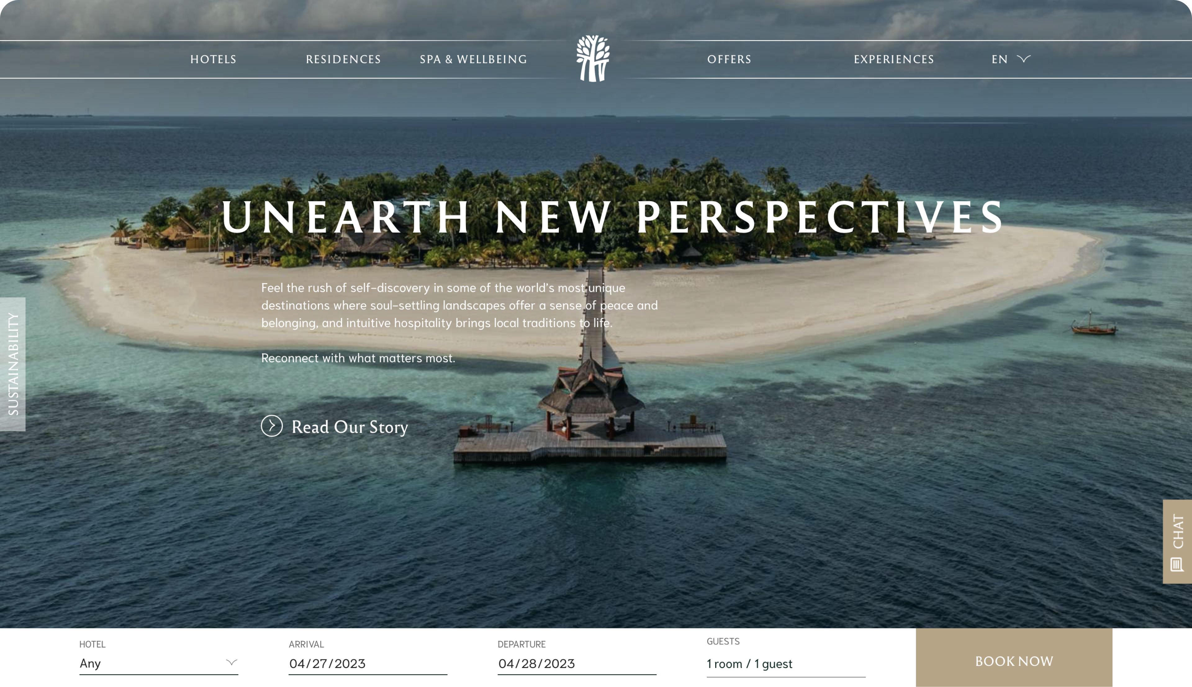
This framework was applied to Banyan Tree Group’s global website revamp. With around 1,500 pages for over 60 hotels of Banyan Tree and Angsana, along with the need to cater to 25 countries and their respective languages, the traditional approach of redesigning each page individually would have been excessively time-consuming.
Recognizing this challenge, IT Consultis (ITC) proposed a more efficient solution: leveraging the component-based design framework.
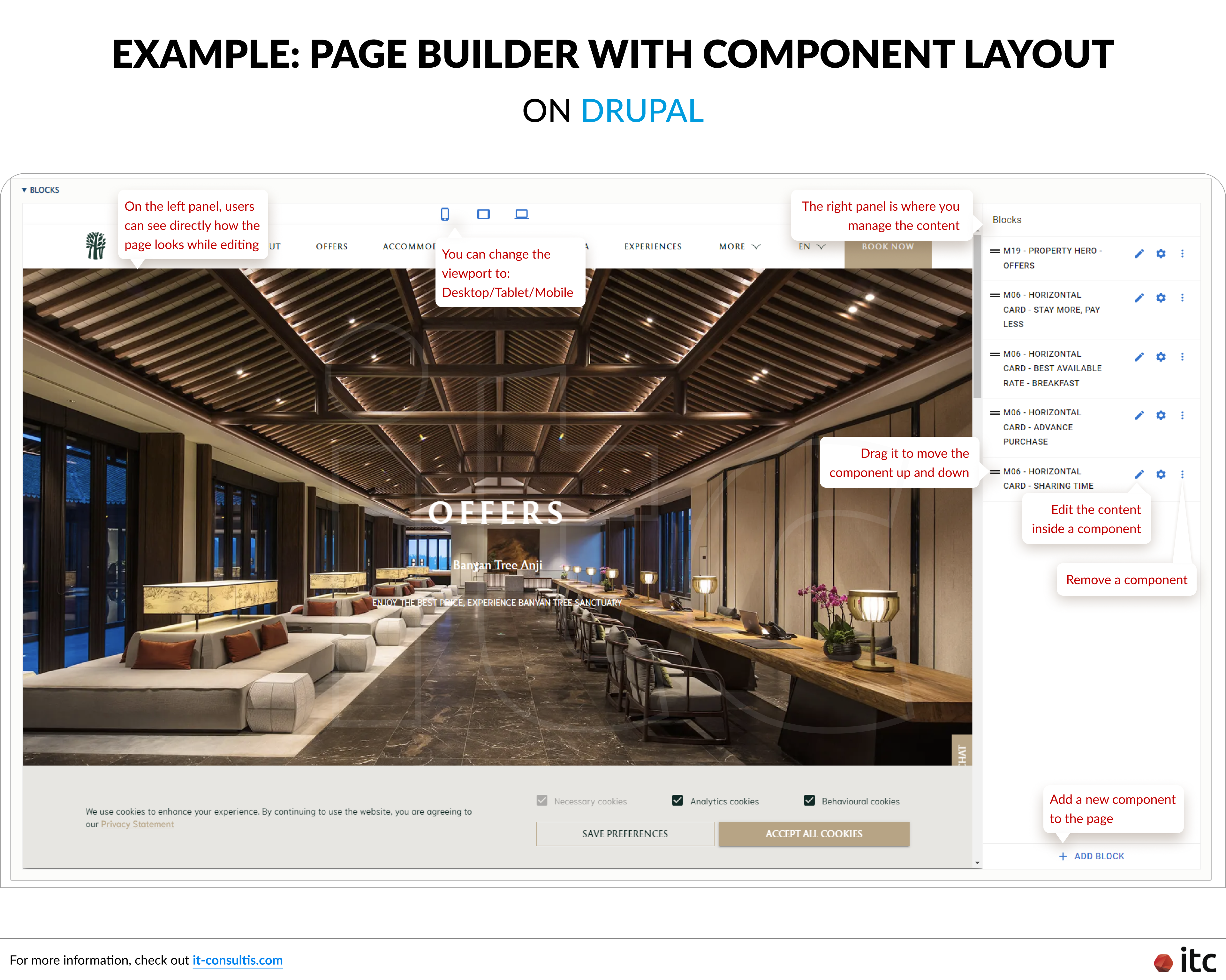
By transitioning from a fixed page layout to a component design approach, powered by the Drupal content management system (CMS), Banyan Tree’s internal team gained unprecedented flexibility. They could now easily manage, add, or remove content blocks from the Back Office, tailoring pages to the brand’s Visual Identity (VI) consistently without relying on extensive coding or redesign efforts.
Additionally, updates or changes to components automatically propagate across all instances where they are used, eliminating the need to manually update each page individually.
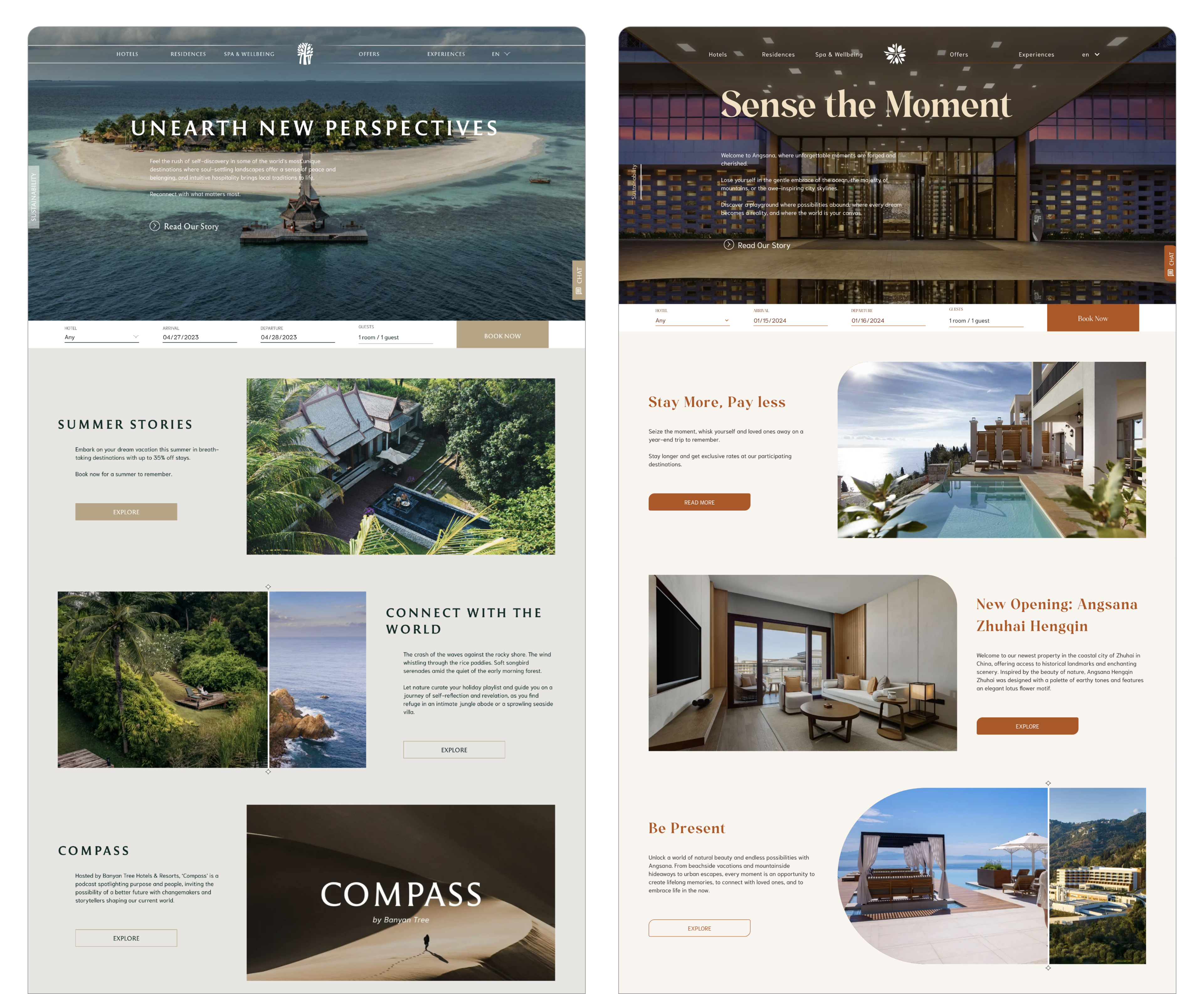
Furthermore, the component-based design for Banyan Tree's website became the go-to template, paving the way for its successful adoption across other hotel brands within the Banyan Tree Group, including Angsana, Dhawa, and Cassia. The standardized framework not only accelerated development but also maintained a cohesive user experience across all properties.
Does Website Development with Component Design Vary across Different Tech Stacks?
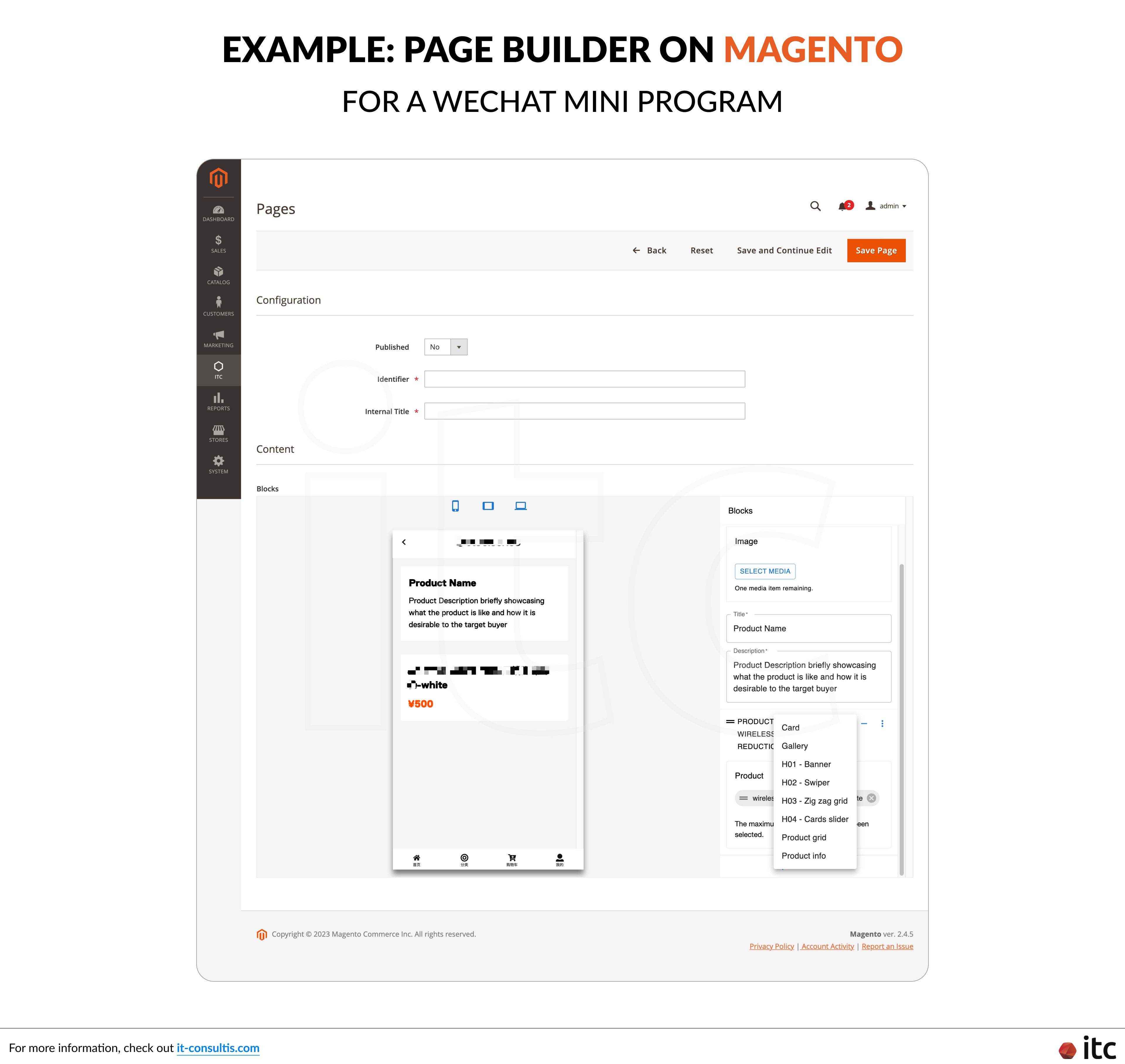
Different back-end technologies, from Content Management System (CMS) like Drupal and WordPress to E-Commerce platforms like Magento, have unique ways of handling component design when building websites.
They each come equipped with their own drag-and-drop Page Builder feature, which is crucial for web development using component design.
The design of components directly impacts how the Page Builder function would be developed.
Technical variations exist among different technology stacks with their own coding style and requirements when employing component-based design system. This necessitates distinct approaches to implementing the Page Builders, including:
- Configuring APIs
- Setting up data field mapping on the frontend according to the API
- Constructing frontend components as plugins to be embedded with the back-office for preview screen
Understanding these differences helps us build websites, or even apps and (WeChat) Mini Programs, that work smoothly and efficiently on each platform.
From an admin's perspective, each technology can offer a different content management experience. The way the component layout is designed directly affects how content is managed in the back-office. This varies based on the design possibilities and logic requirements.
What are the Advantages of Component-Based Architecture for Website Development?
To summarize, below are the 5 key benefits of leveraging component-based design:
1. Modularity
Each component in the design system is meticulously designed from scratch to be reusable and easily combinable, fostering code reusability and simplifying the design and development processes.
2. Flexibility
Components are not tied to a singular page layout or design, freeing them from rigid page layouts. They can seamlessly accommodate various content areas, campaign-specific scenarios, or differing content volumes. With a rich library of reusable components, developers and content teams enjoy the freedom to swiftly assemble and tailor pages to meet evolving requirements.
3. Scalability
The component library grows in tandem with the website and team expansion. Based on modular building blocks, each component can be continuously refined, ensuring the Component Library remains comprehensible, adaptable, and maintainable amidst increasing complexity. Changes to components are easily mass-adapted to all applicable pages on the website.
4. Efficiency
With the streamlined website development process, UX, Development, Testing, and Content teams can pivot their attention toward iteration and optimization focusing on components rather than individual pages. This strategic shift in efficiency also allows for more time and effort to amplify the impact on site usability, conversion rates, accessibility, governance, and performance.
5. Consistency
By emphasizing reusable components and designing from the elemental level upwards, brand identity, style, and design coherence are effortlessly upheld throughout the site.
No longer is each page subject to the discretion of individual designers, developers, or content editors. Instead, brand identity and style guides are ingrained within every element and component from inception, ensuring consistent and cohesive user experiences across the entire website.
IT Consultis (ITC) is an award-winning Digital Transformation Consultancy in China & APAC, empowering Fortune 500 companies with the right strategy & execution playbook to grow revenue and build customer loyalty.
We can help you craft bespoke digital enablers (Website, WeChat Mini Program, App) leveraging powerful E-Commerce (Magento, Adobe Commerce) & CMS (Drupal, WordPress, Acquia) technologies and front-end frameworks (React, Taro, NextJS, VueJS, NuxtJS, Typescript, Eslint), establishing the right infrastructural foundation.
ITC will also help you implement any necessary integrations with your global and local business systems to ensure a seamless data flow and customer experience, while ensuring compliance with local regulations (i.e., PIPL).


